CIRQUE LE SOIR

PROJECT INFORMATION:
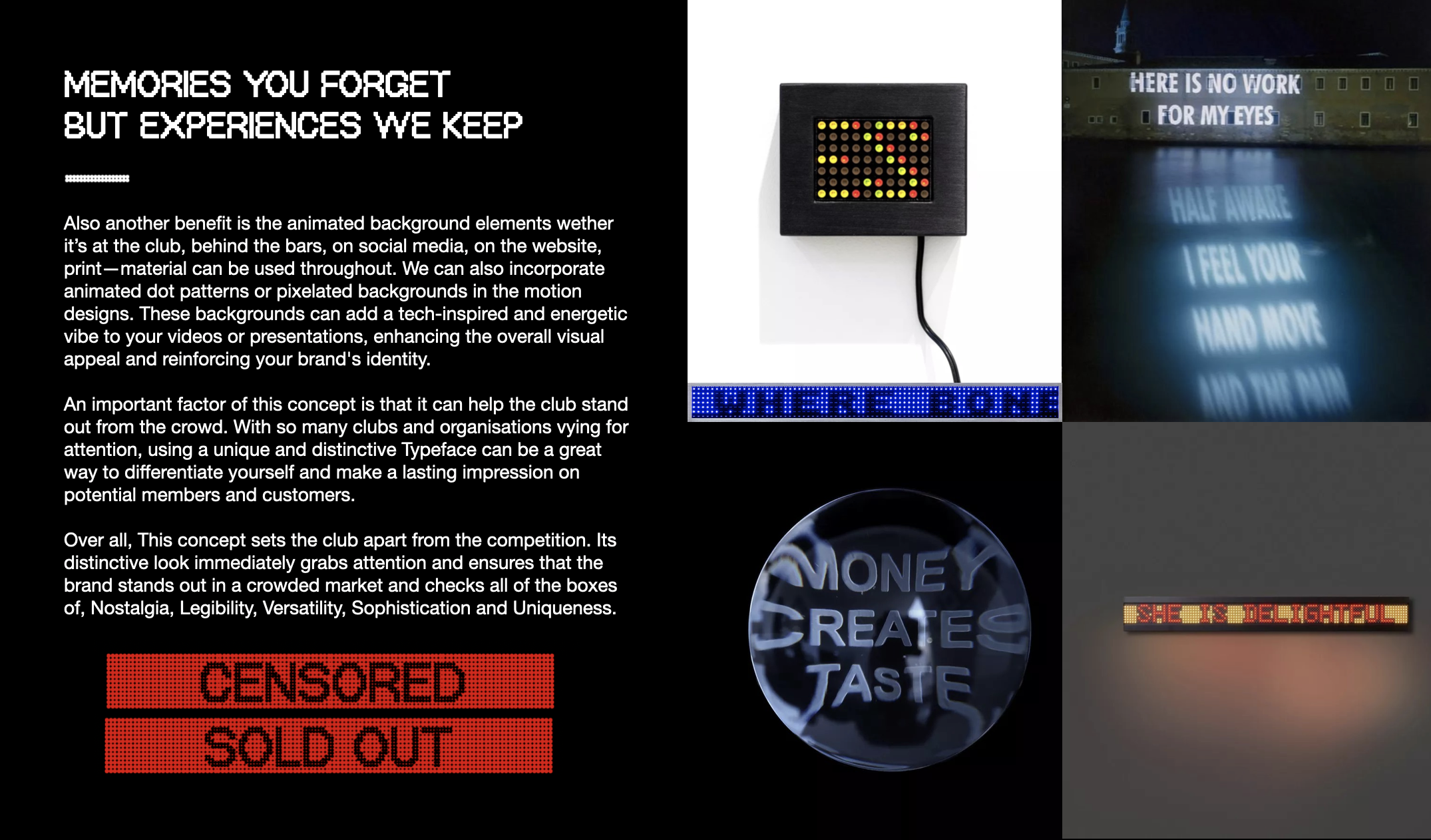
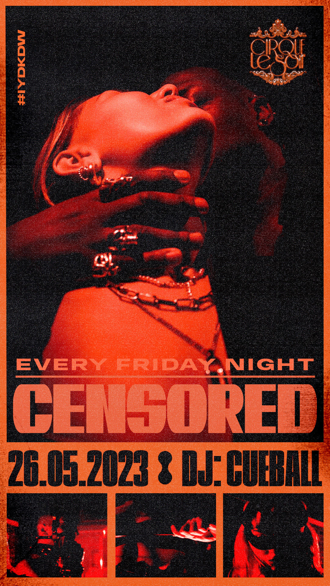
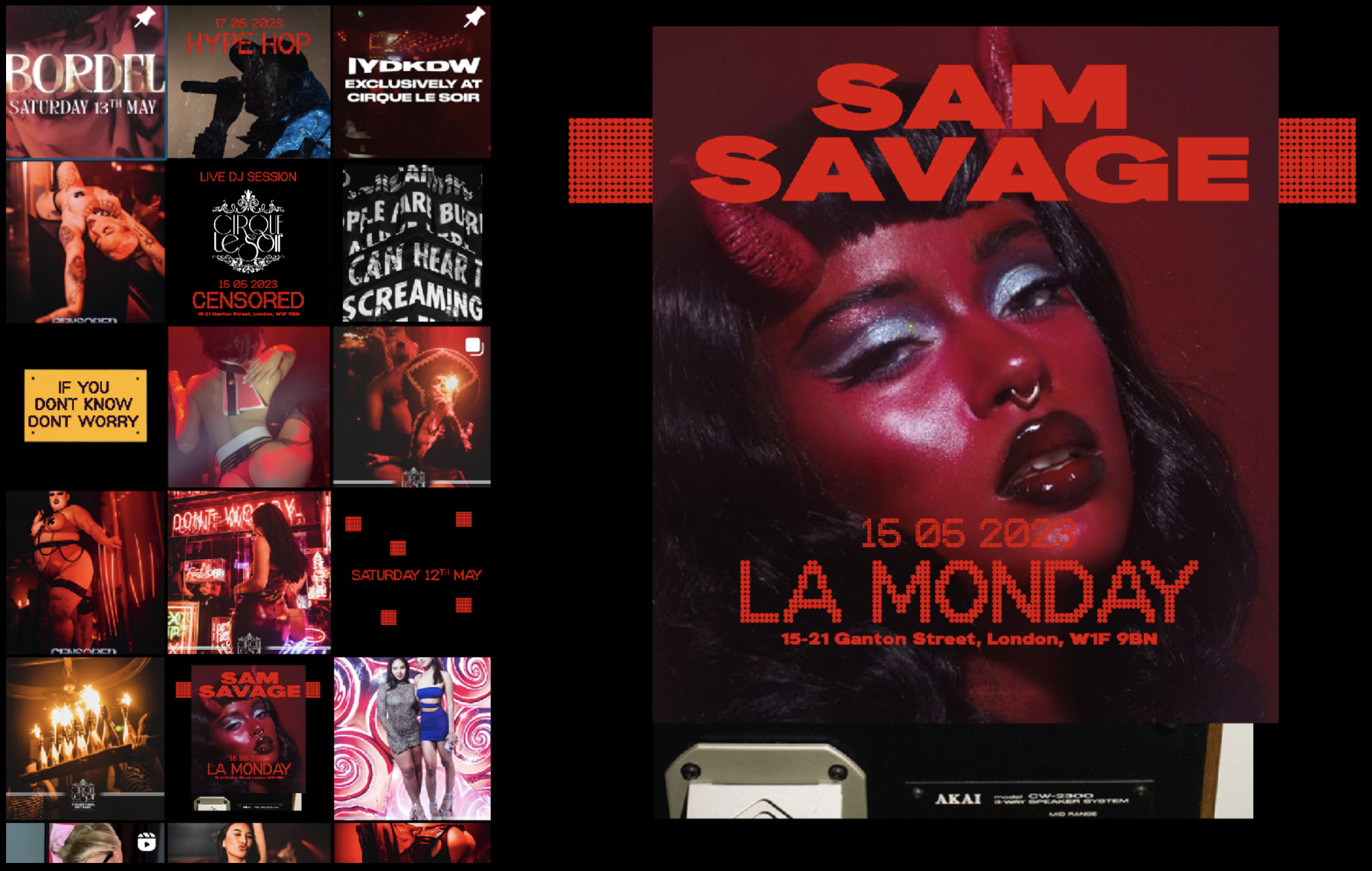
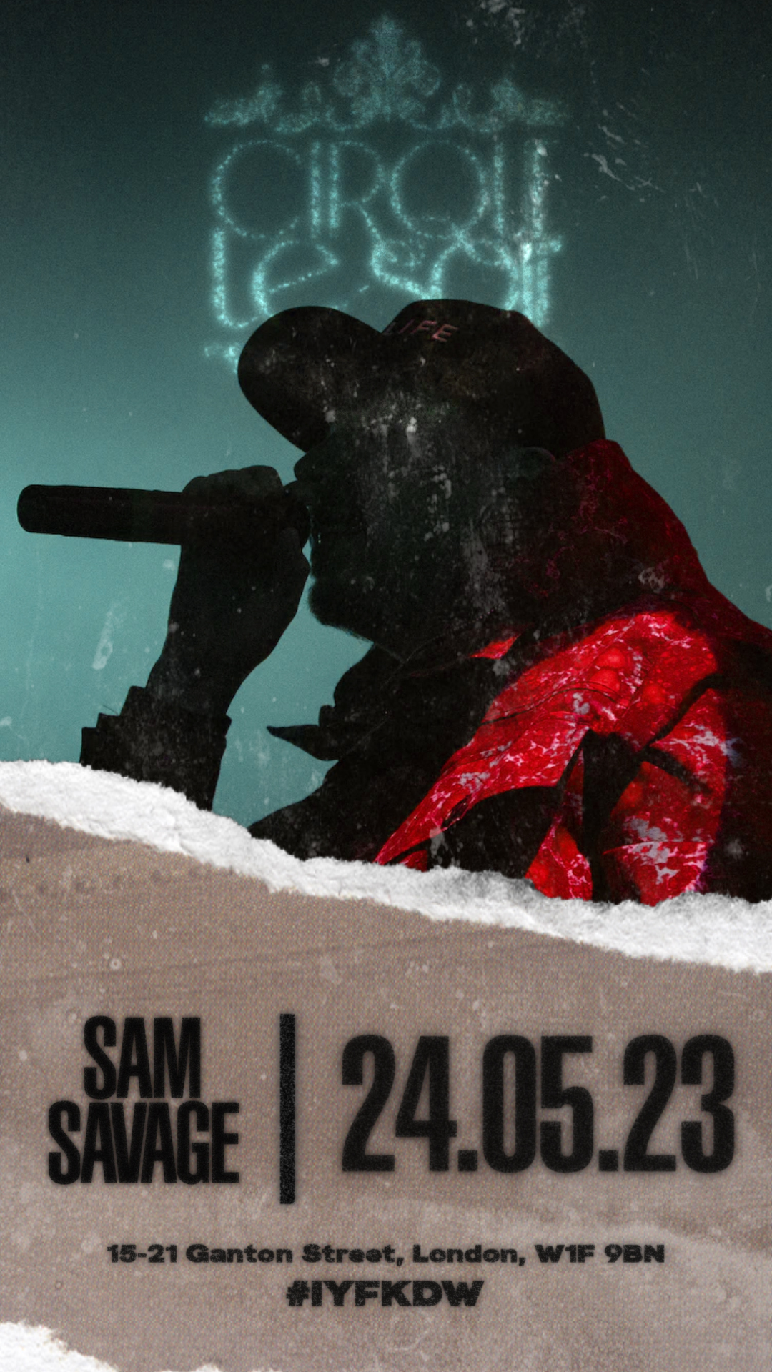
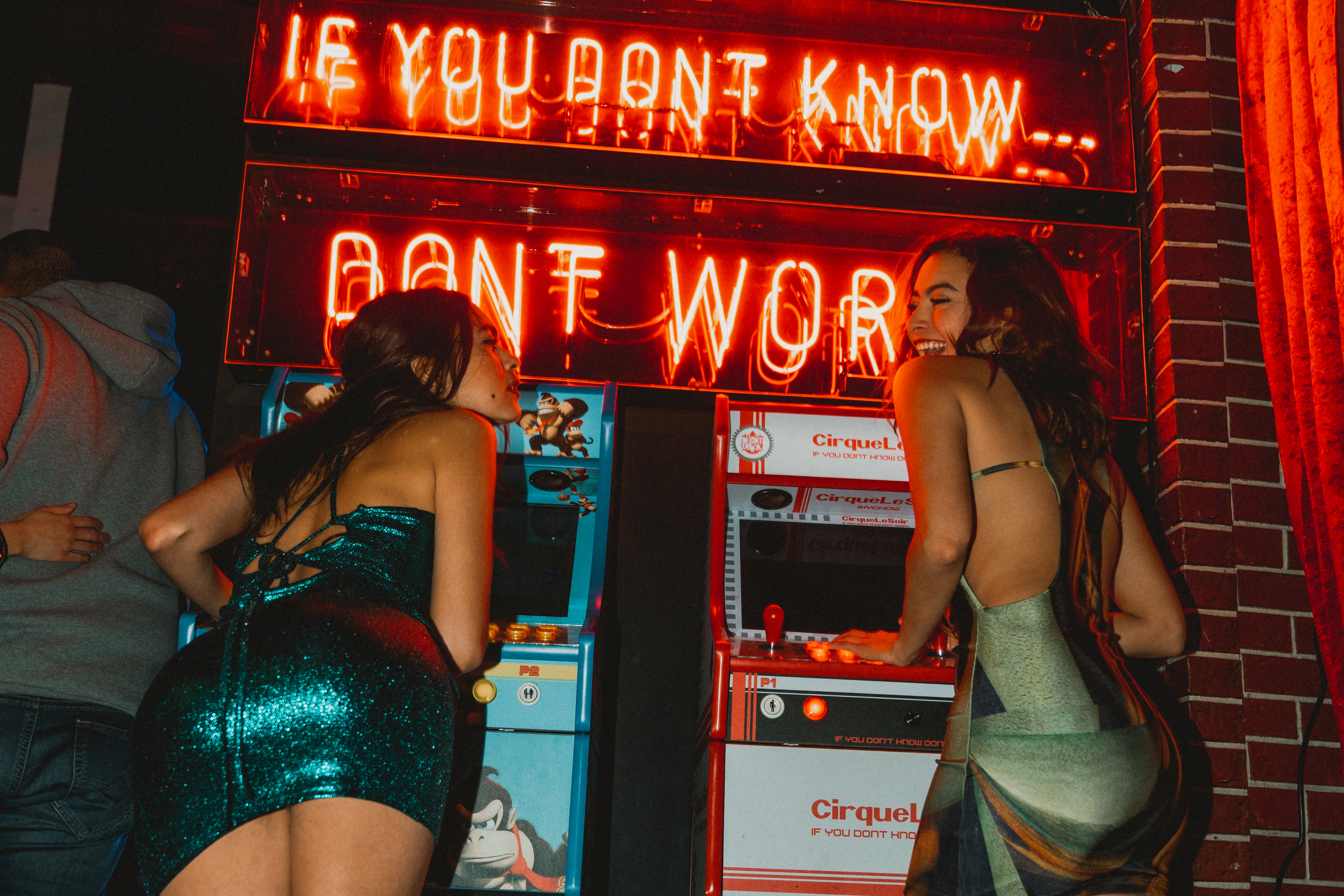
By embracing our brand identity concept, CLS opened their doors to a world of unique possibilities and captivating visual experiences. Our concept sets the club apart from all other clubs and instantly catches the eye of potential members and customers. Its nostalgic appeal taps into a shared cultural memory, creating an emotional connection that resonates deeply with the target audience.
Our branding strategy captures the essence of the club's unique identity, appealing to both established members and the younger demographic. By adopting this custome Typeface, they’ve sent a powerful message that the club embraces the past while embracing the future, creating an experience that is both timeless and forward-thinking. In the competitive landscape of clubs, a strong visual identity is crucial for capturing attention, generating interest, and fostering loyalty.
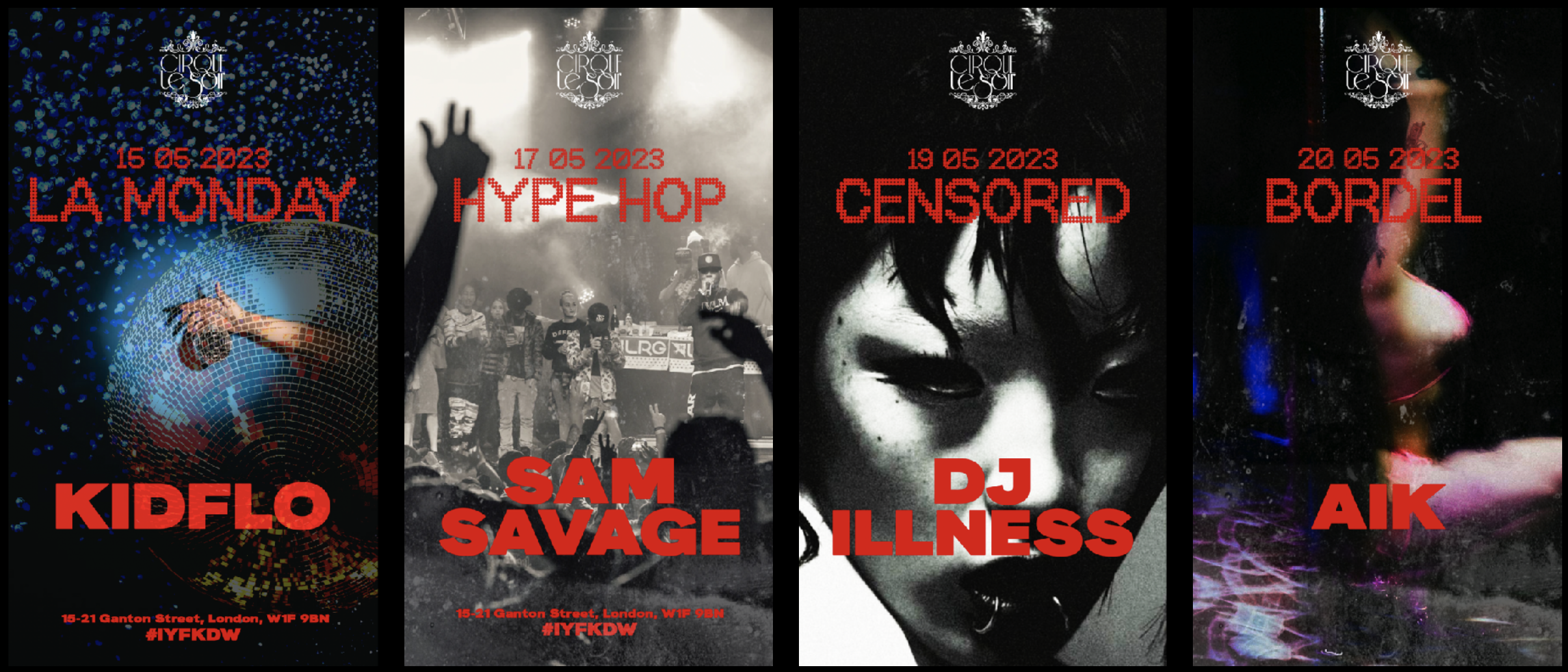
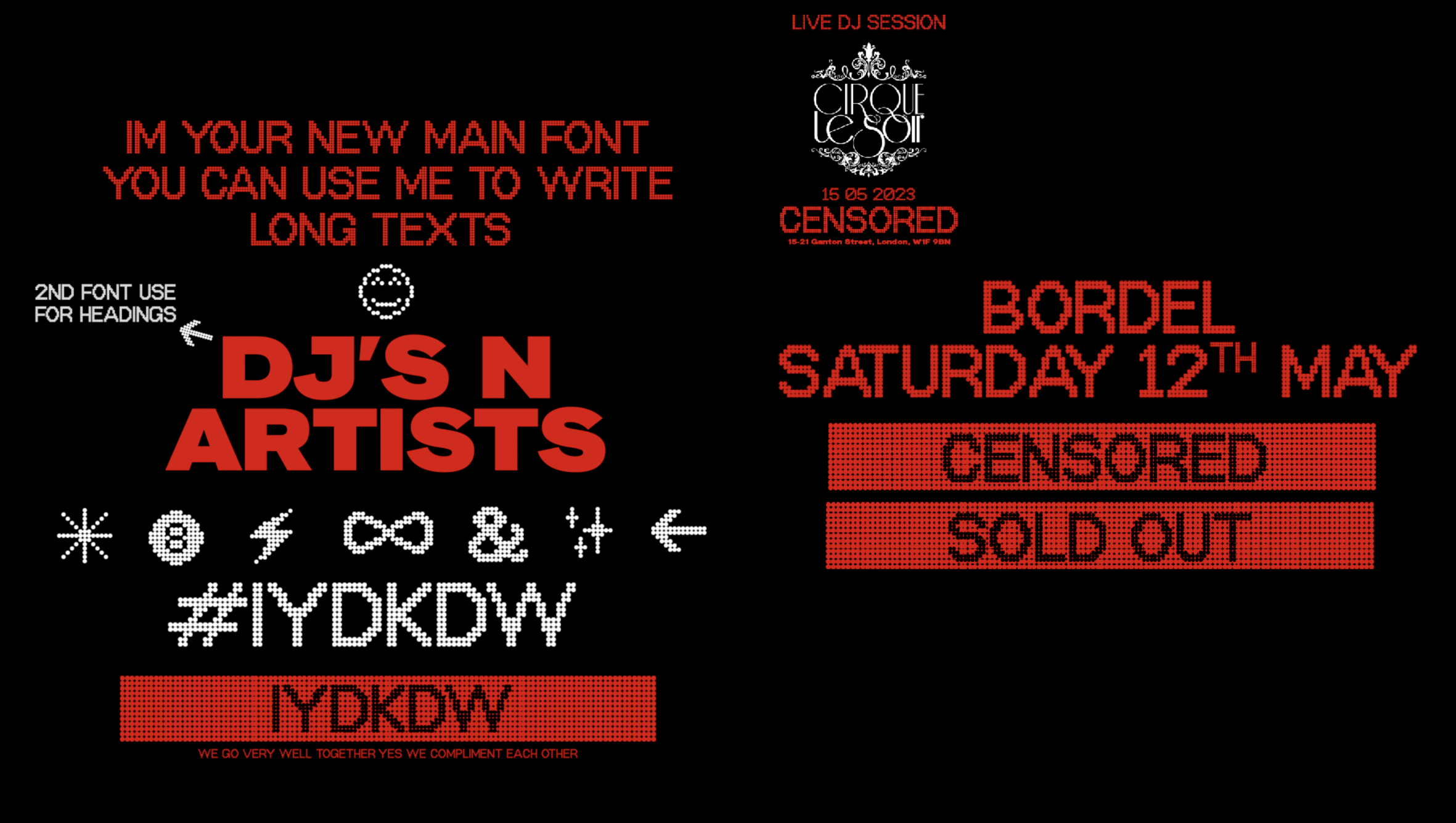
The dot-matrix Typeface perfectly encapsulates these qualities. Using this typeface was a great choice to convey a sense of modernity and technology, while also evoking a sense of nostalgia for the early days of the party/club scene.
Team & Credits:
︎︎︎ Creative direction: Disomt Studios
︎︎︎ Strategy: Disomt Studios
︎︎︎ Motion: Benjamin
︎︎︎ Client: Cirque Le Soir & The Cream Group
︎︎︎ Special Thanks to Charlie and the CLS team
Services:
︎︎︎ Creative direction
︎︎︎ Branding
︎︎︎ Strategy
︎︎︎ Concept Development