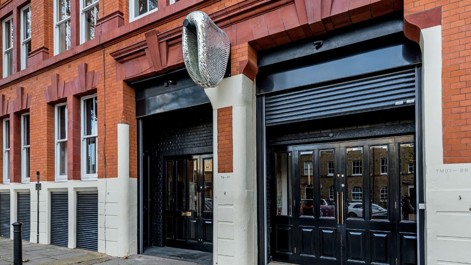
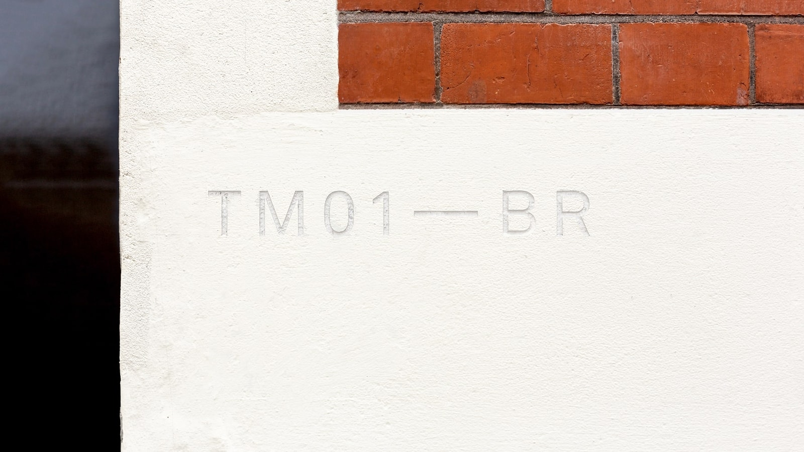
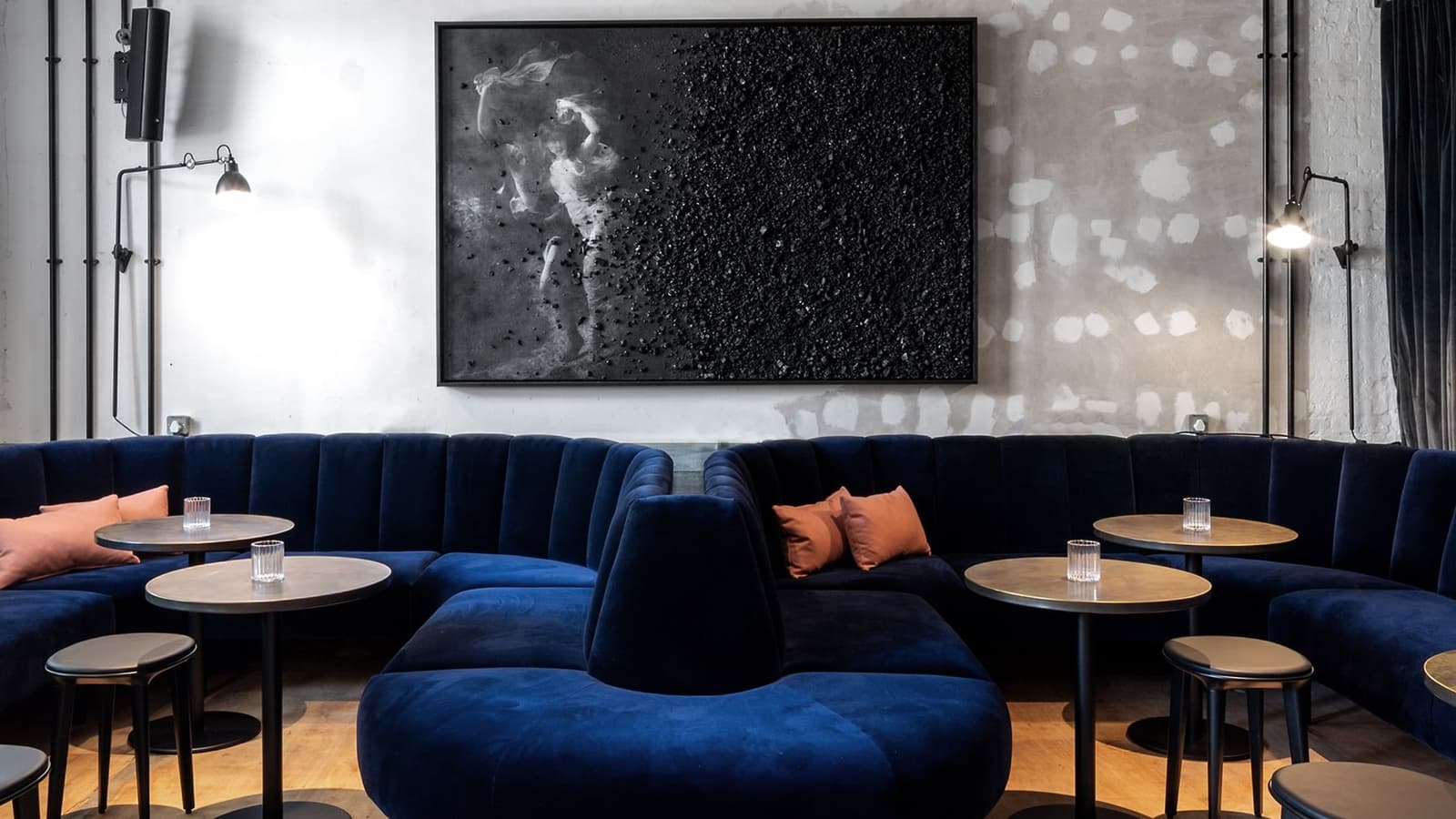
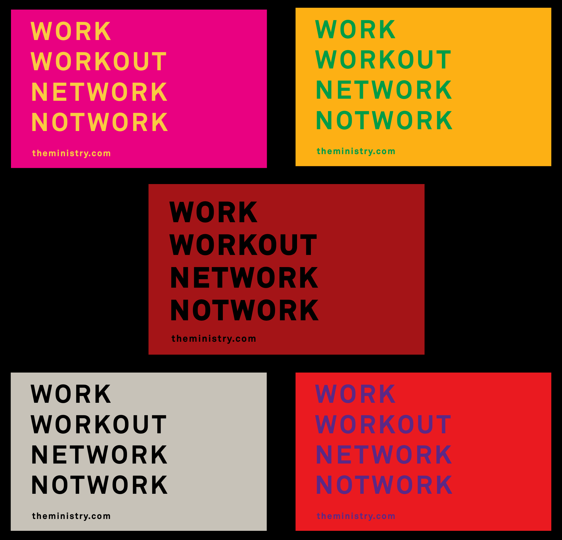
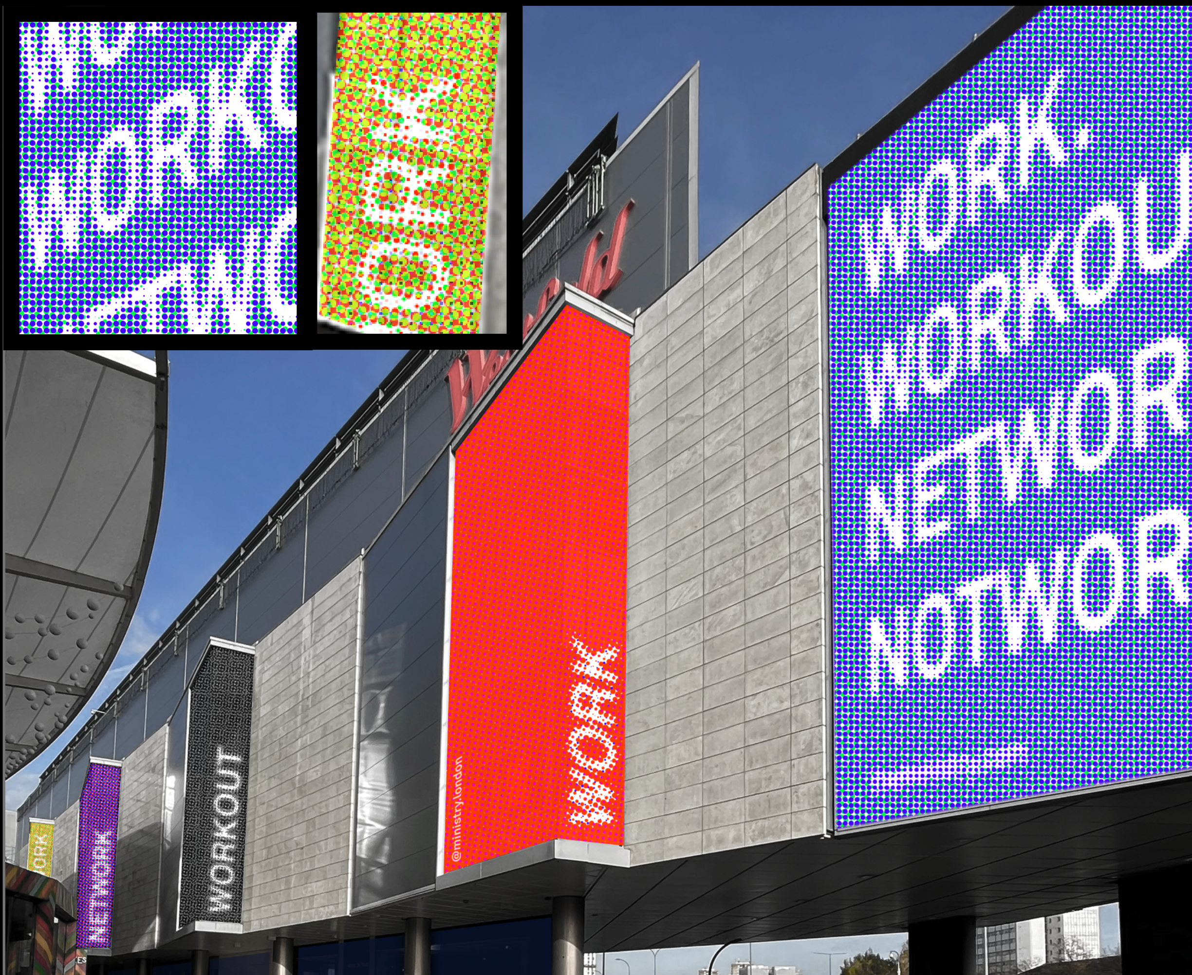
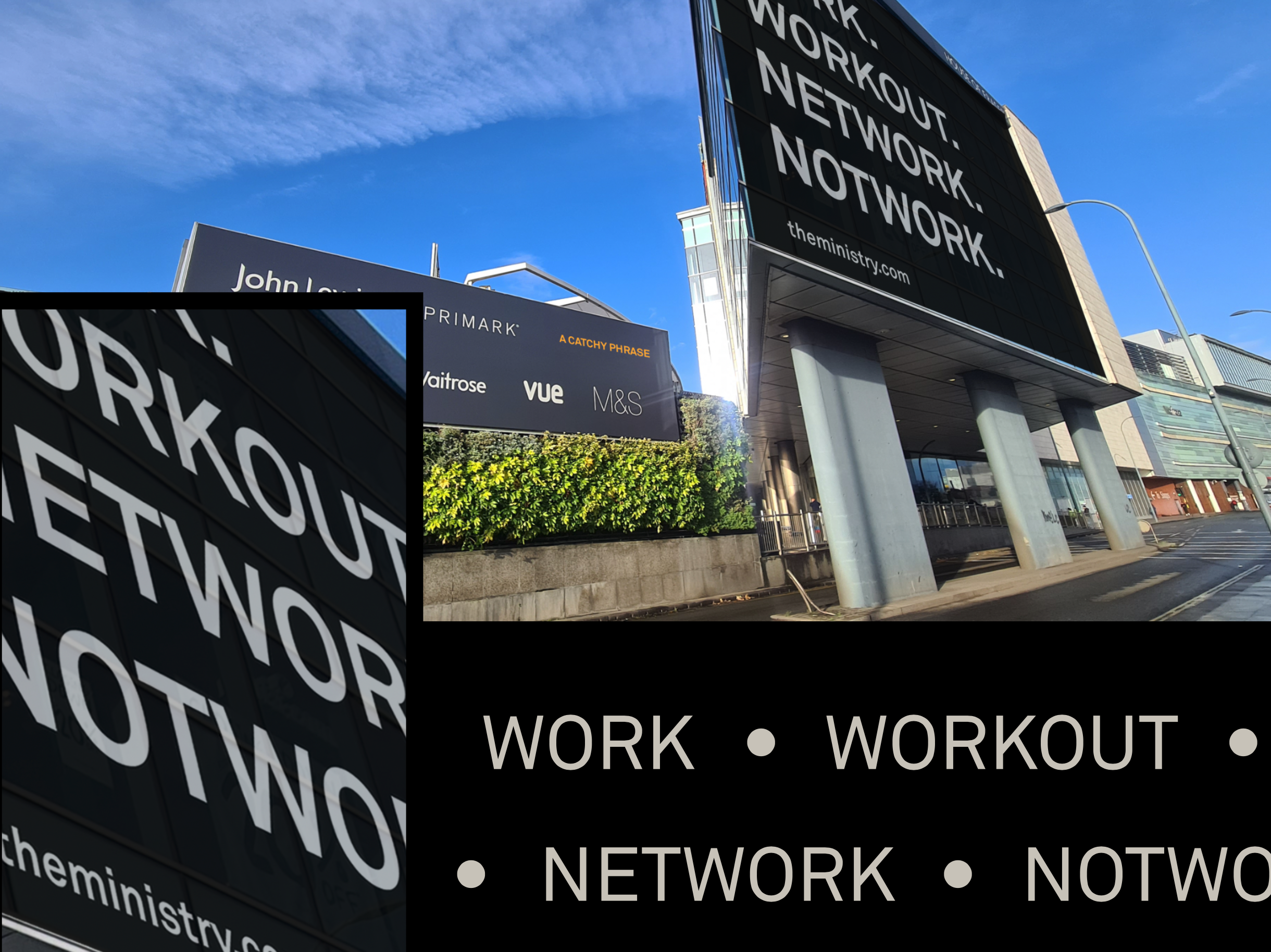
WESTFIELD & MINISTRY MEMBERS CLUB


PROJECT INFORMATION:
Our goal was to create a brand that would capture the essence of Ministry of Sound and set it apart from other members clubs in the industry. We began by conducting in-depth market research and understanding the target audience, their preferences, and aspirations. This helped us identify the key differentiators of Ministry of Sound and define the creative direction accordingly.
Our goal was to create a brand that would capture the essence of Ministry of Sound and set it apart from other members clubs in the industry. We began by conducting in-depth market research and understanding the target audience, their preferences, and aspirations. This helped us identify the key differentiators of Ministry of Sound and define the creative direction accordingly.
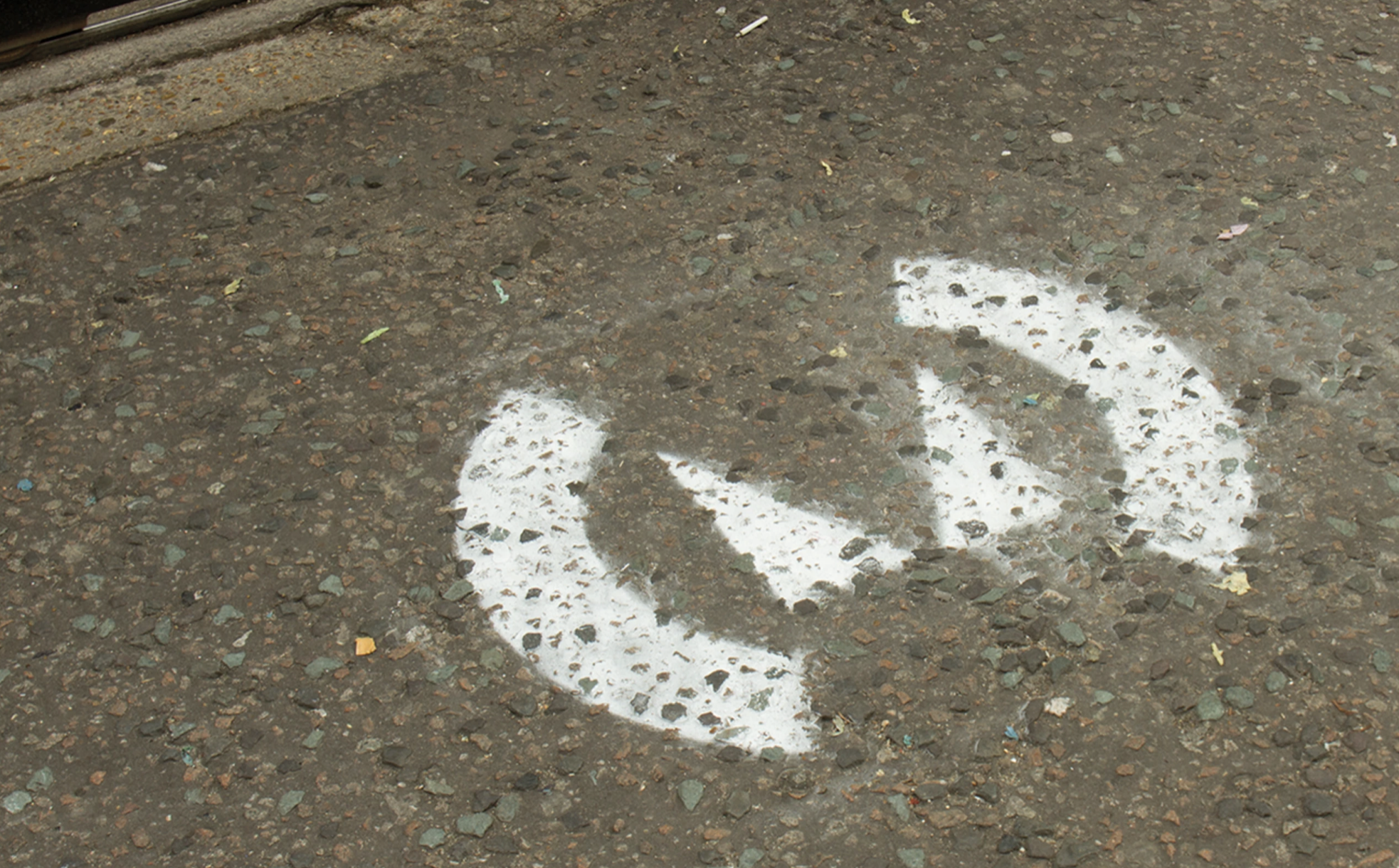
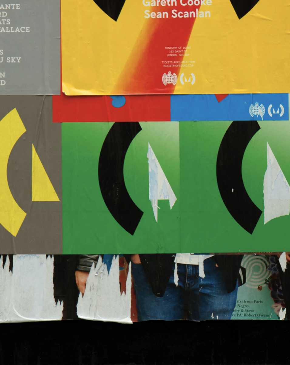
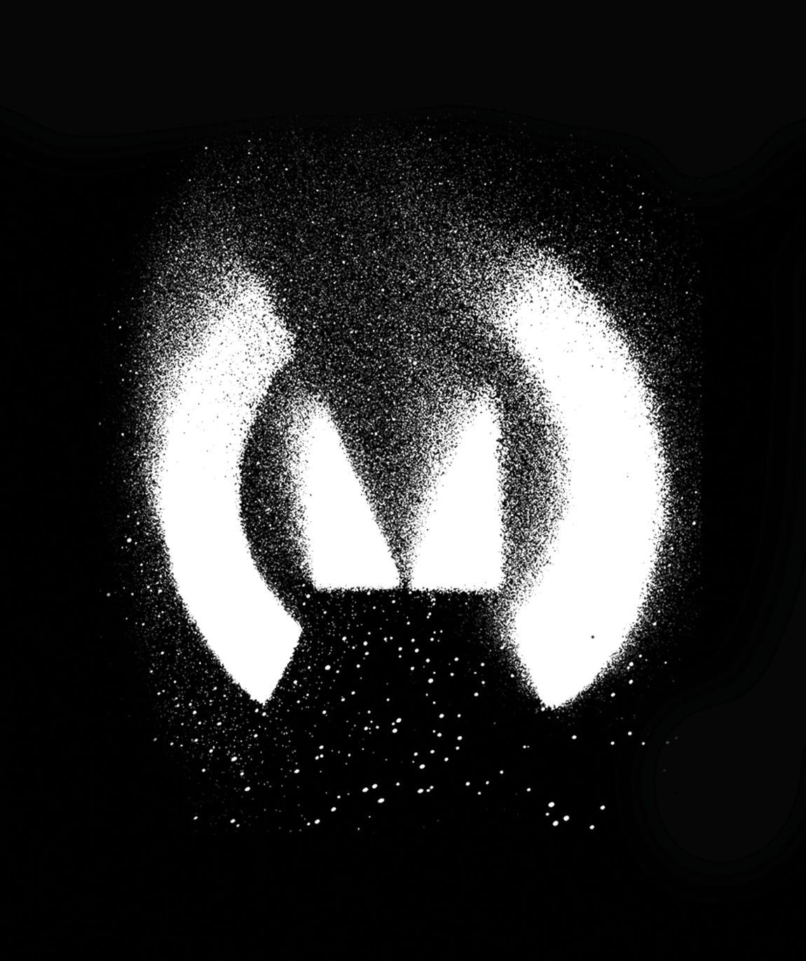
After exploring all possible ideas with the team, we decided to go for a brand identity that is modern, sophisticated, and exclusive, with a touch of music-inspired elements to reflect the core essence of the club. The concept was to infuse the brand with a sense of elegance and sophistication, while also incorporating a modern and luxurious style to appeal to the target audience.
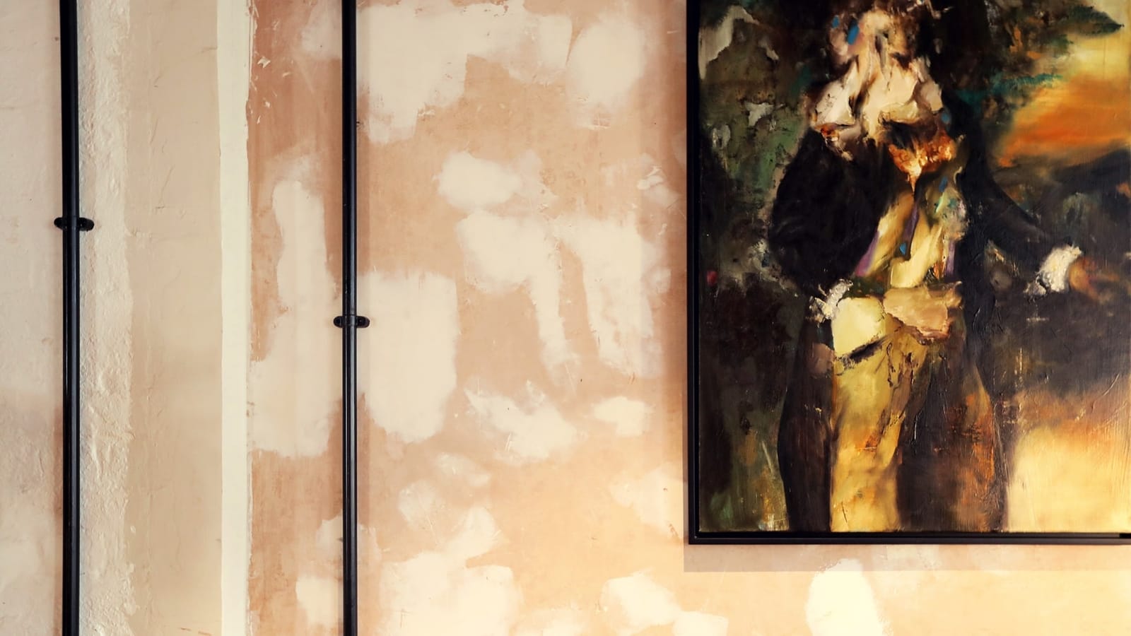
Furthermore, we have developed various design collaterals, such as enviromental designs, flyers, posters, christmas cards and social media assets that align with the brand identity we have created.
Team & Credits:
︎︎︎ Creative direction: Simon Moore, Disomt Studios
︎︎︎ Logo design: Spin Studios
︎︎︎ Design: Disomt Studios
︎︎︎ Client: Westfield, Ministry Members Club
︎︎︎ Thanks to Simon, James and all the ministry of sound club team.
Services:
︎︎︎ Creative direction
︎︎︎ Branding
︎︎︎ Concept development
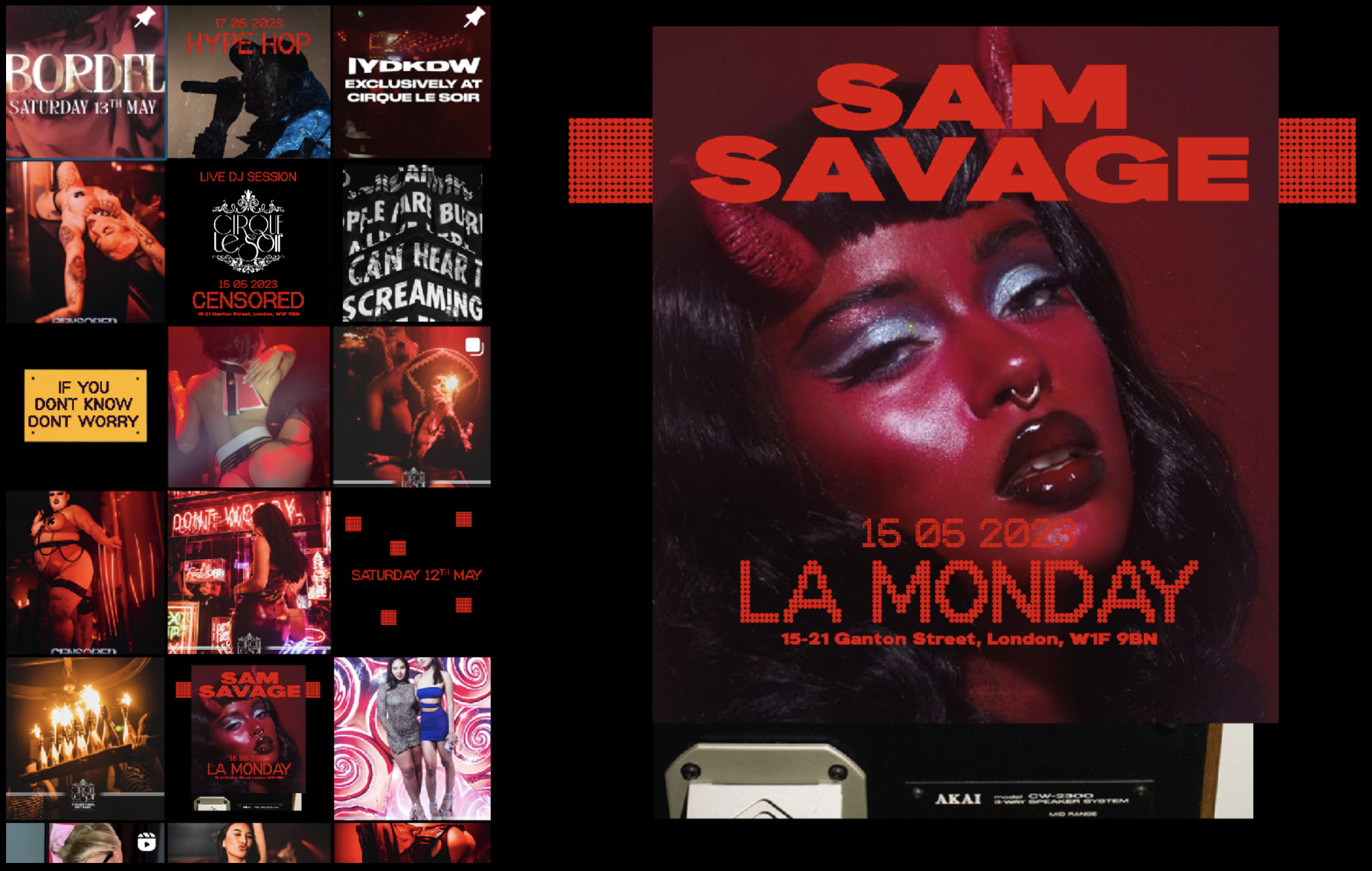
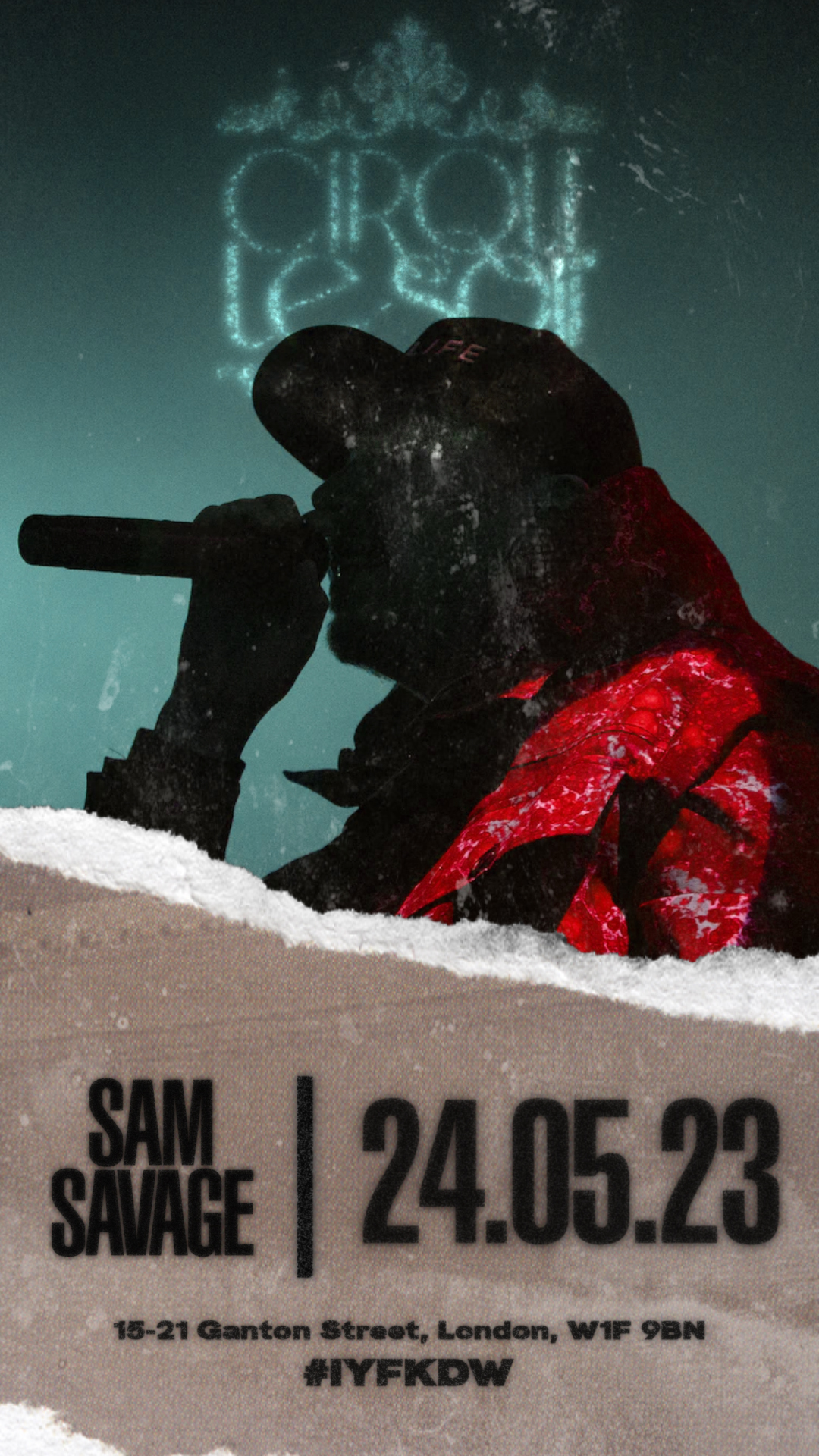
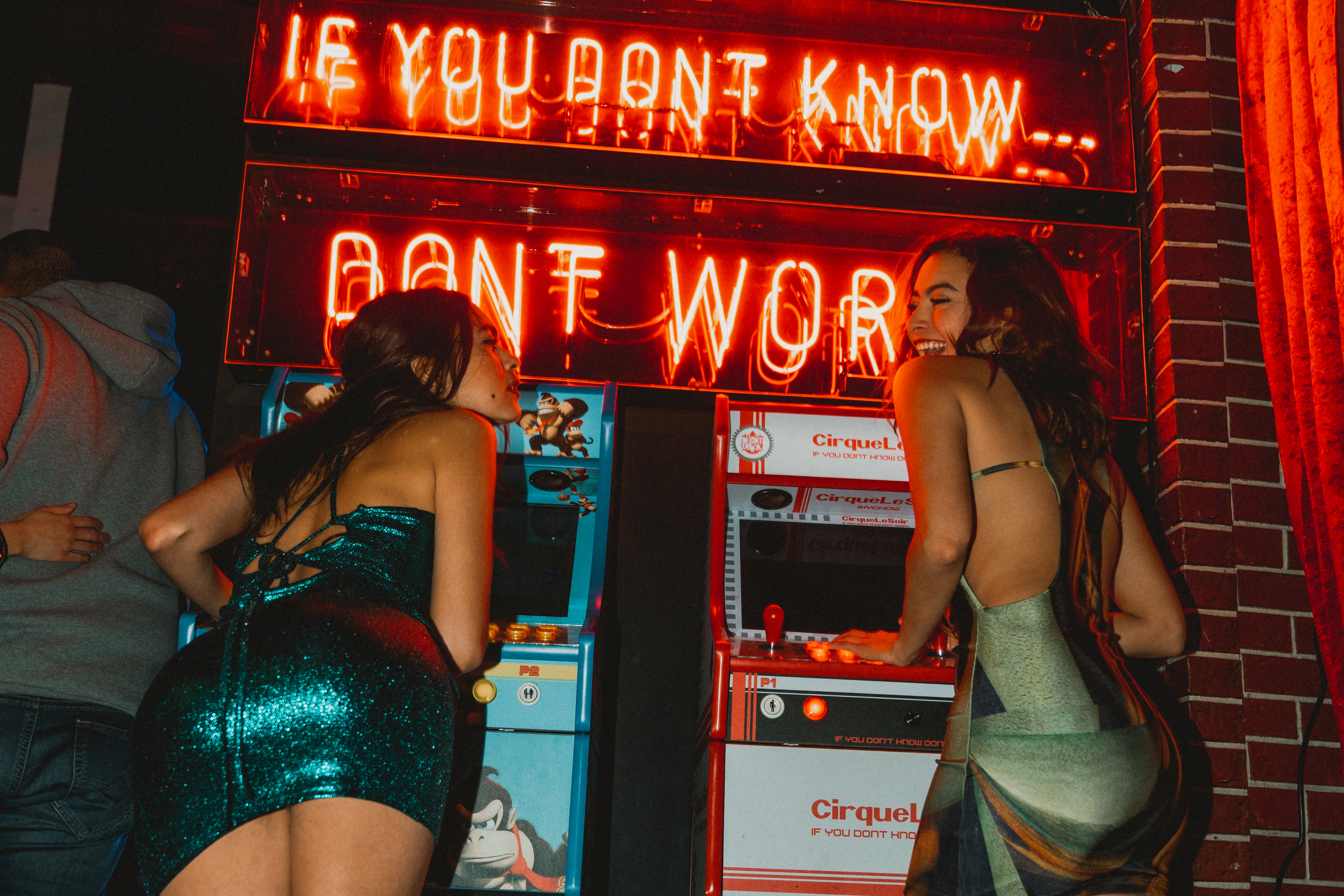
CIRQUE LE SOIR

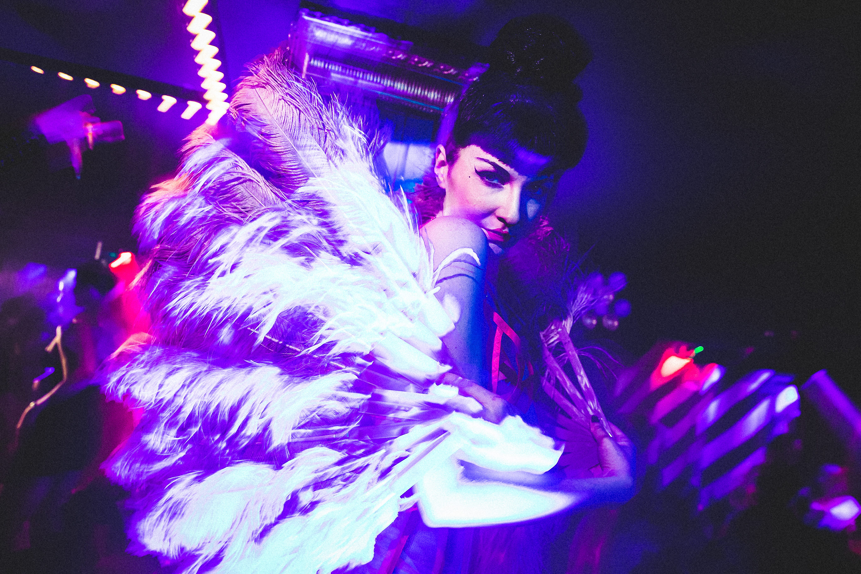
PROJECT INFORMATION:
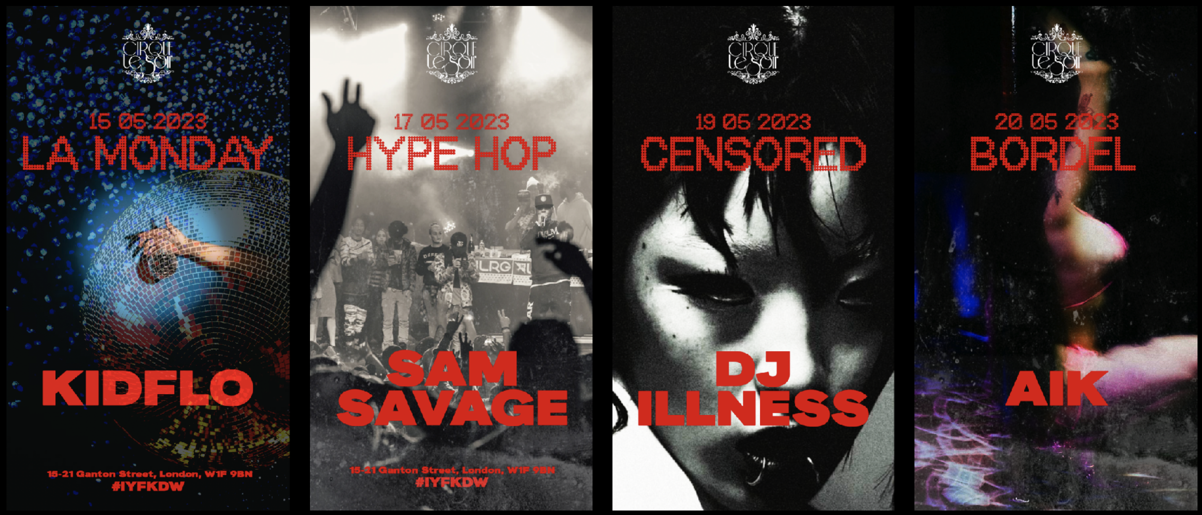
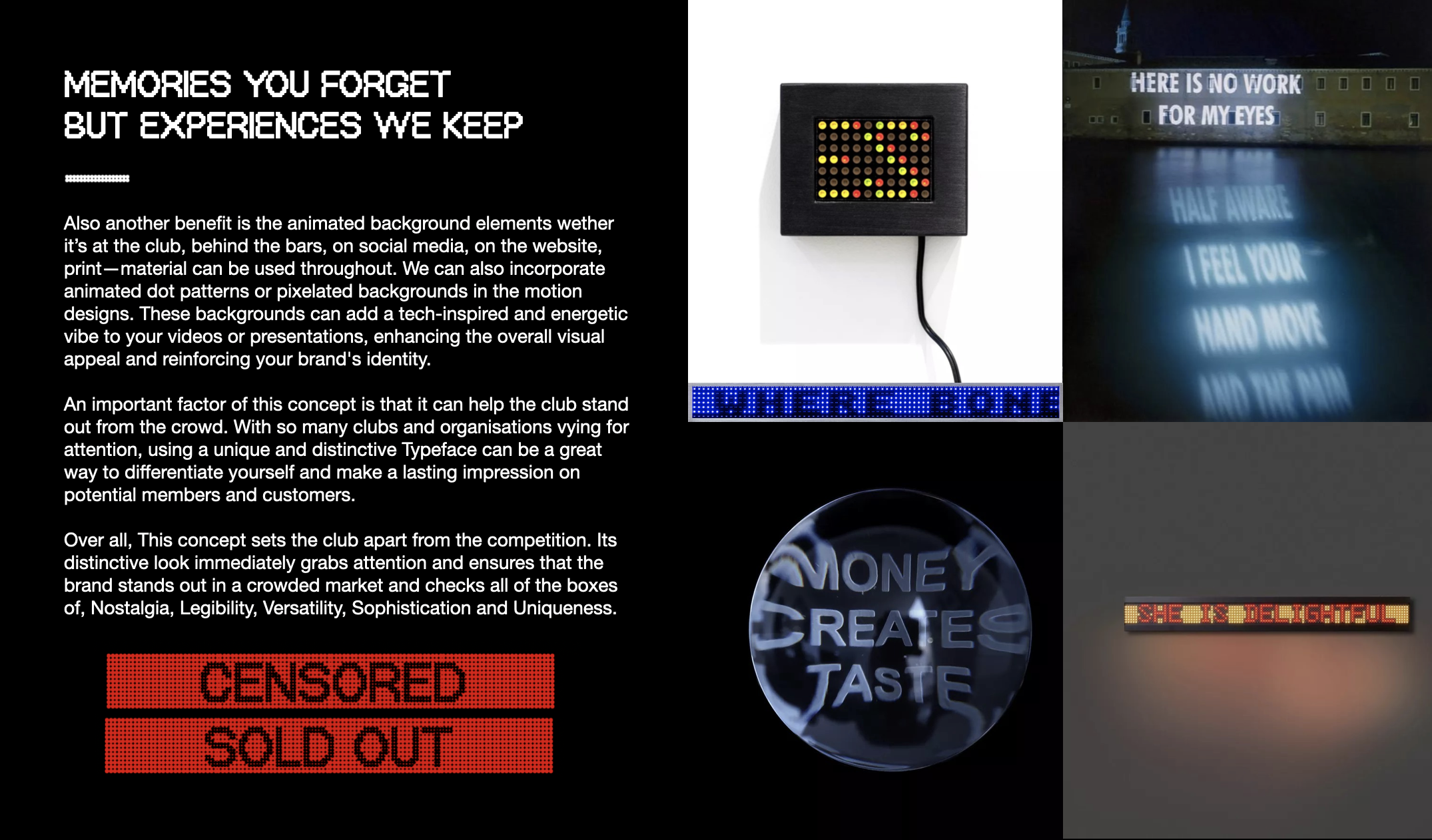
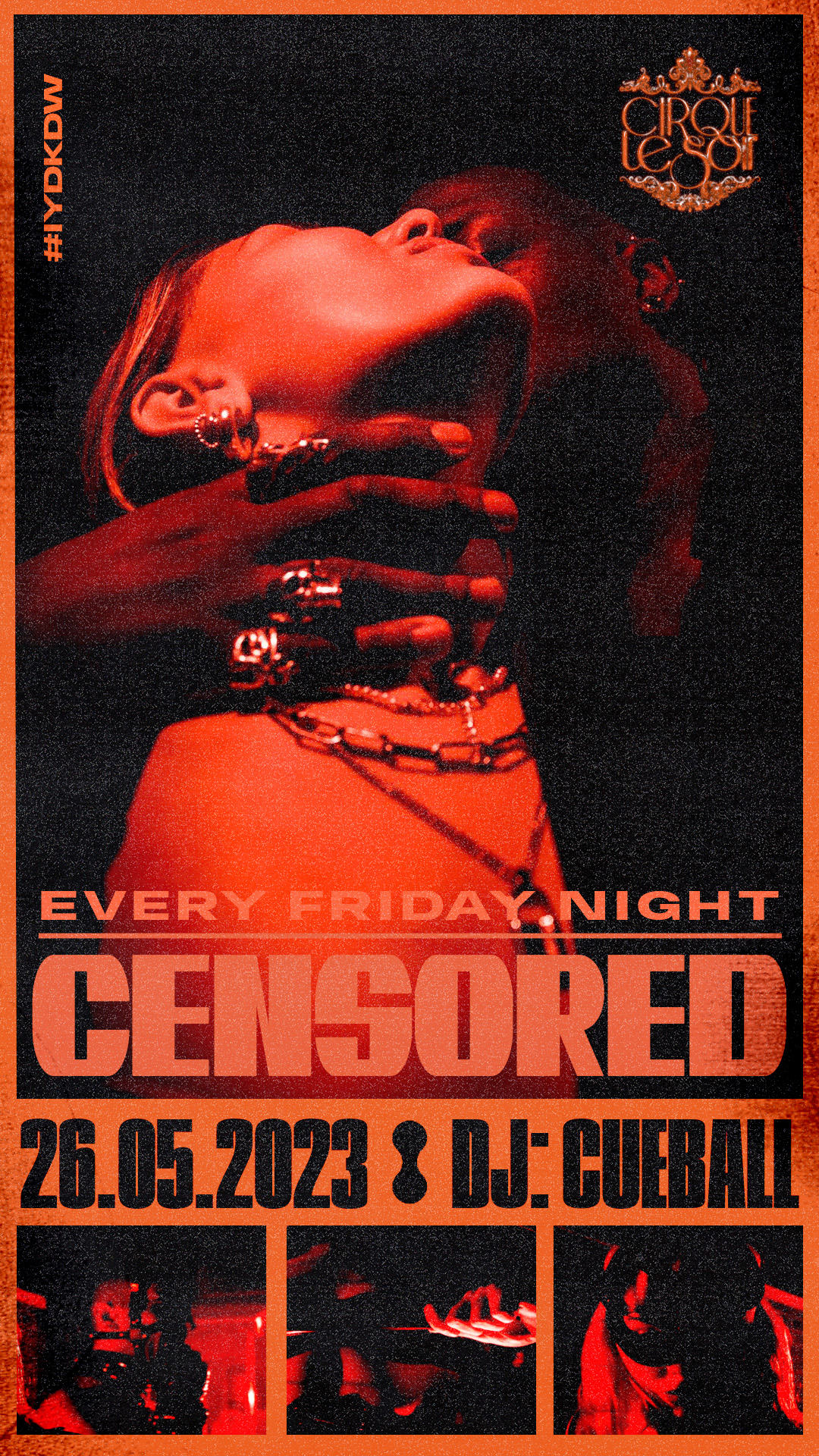
By embracing our brand identity concept, CLS opened their doors to a world of unique possibilities and captivating visual experiences. Our concept sets the club apart from all other clubs and instantly catches the eye of potential members and customers. Its nostalgic appeal taps into a shared cultural memory, creating an emotional connection that resonates deeply with the target audience.
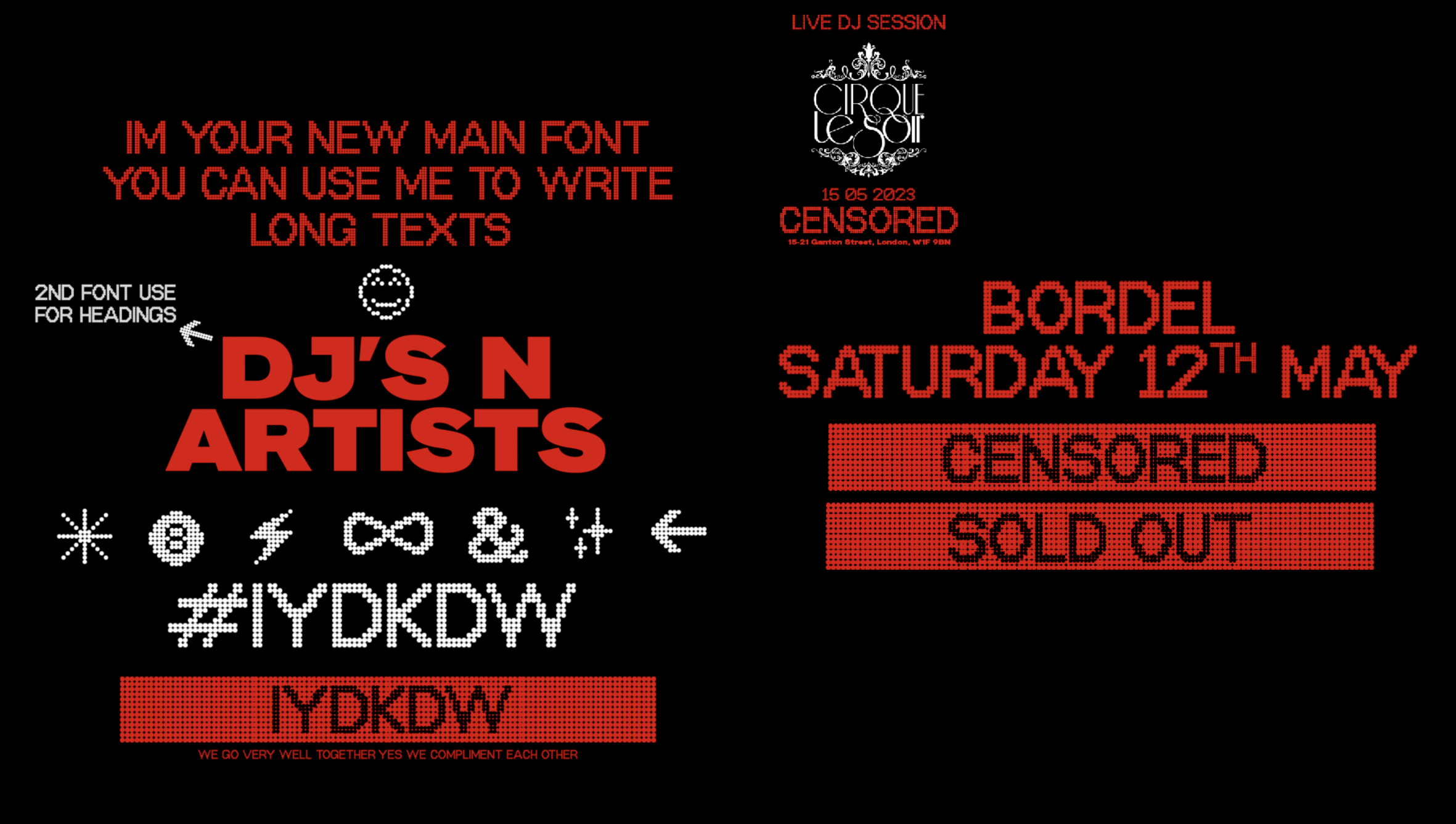
Our branding strategy captures the essence of the club's unique identity, appealing to both established members and the younger demographic. By adopting this custome Typeface, they’ve sent a powerful message that the club embraces the past while embracing the future, creating an experience that is both timeless and forward-thinking. In the competitive landscape of clubs, a strong visual identity is crucial for capturing attention, generating interest, and fostering loyalty.
The dot-matrix Typeface perfectly encapsulates these qualities. Using this typeface was a great choice to convey a sense of modernity and technology, while also evoking a sense of nostalgia for the early days of the party/club scene.
Team & Credits:
︎︎︎ Creative direction: Disomt Studios
︎︎︎ Strategy: Disomt Studios
︎︎︎ Motion: Benjamin
︎︎︎ Client: Cirque Le Soir & The Cream Group
︎︎︎ Special Thanks to Charlie and the CLS team
Services:
︎︎︎ Creative direction
︎︎︎ Branding
︎︎︎ Strategy
︎︎︎ Concept Development
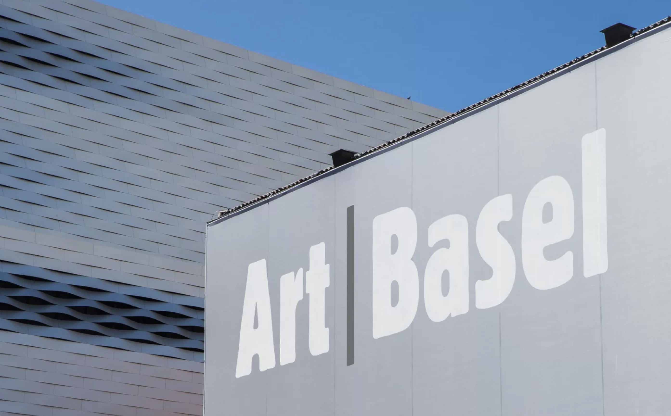
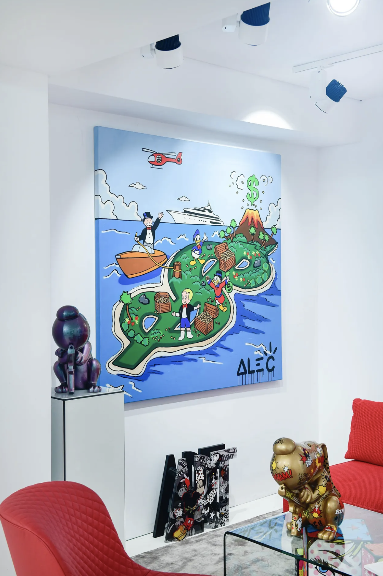
MIAMI ART BASEL x ALEC MONOPOLY


PROJECT INFORMATION:
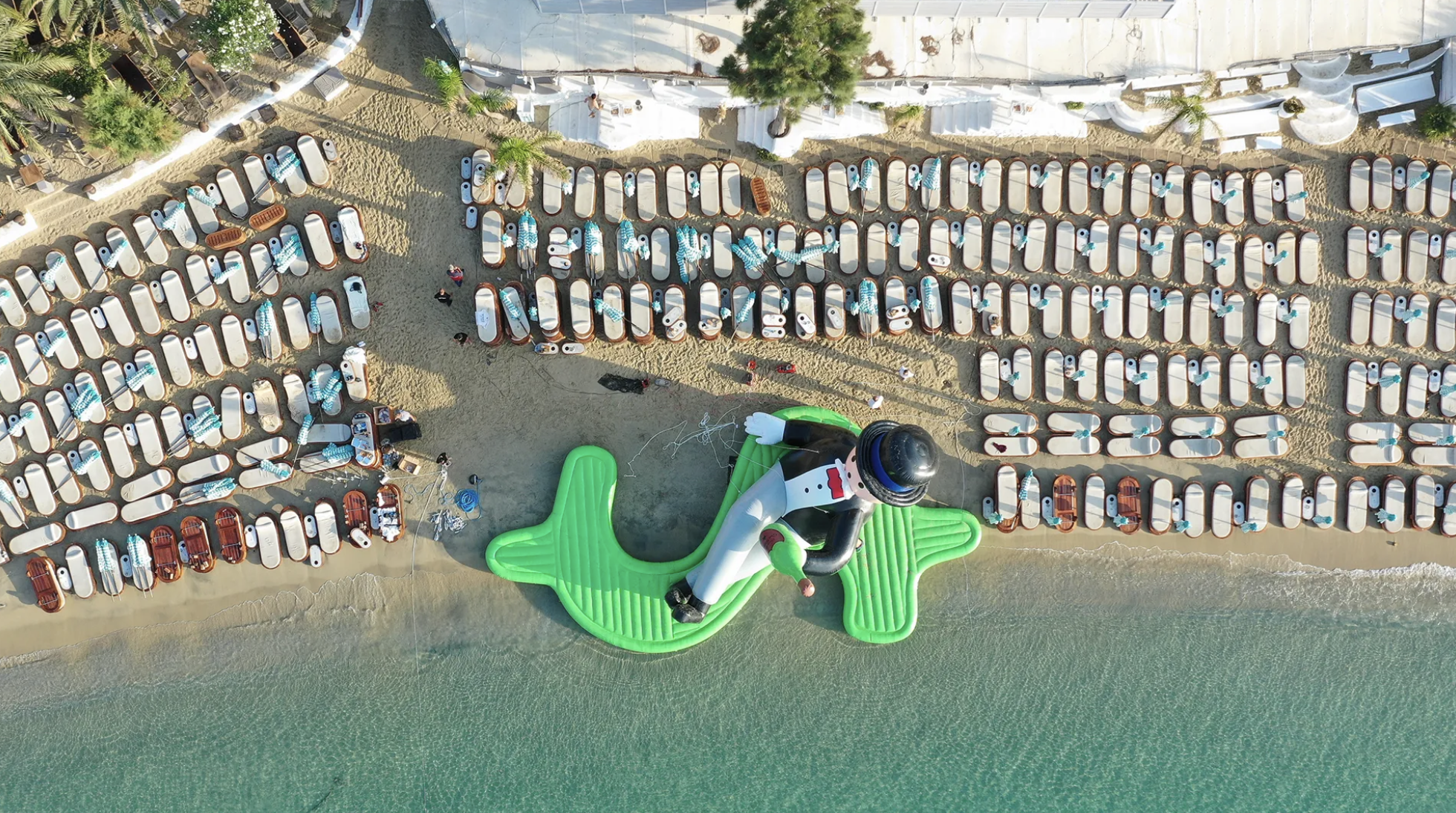
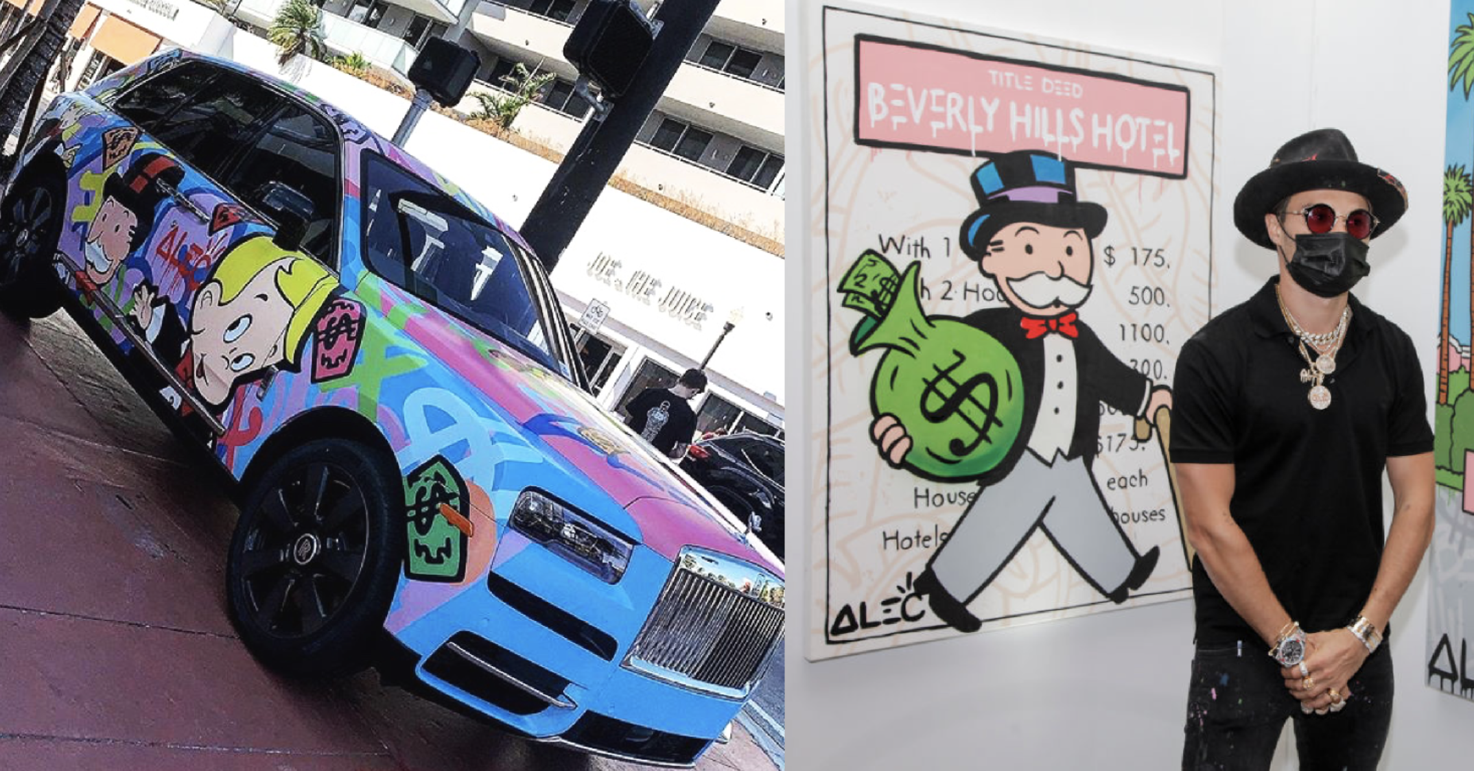
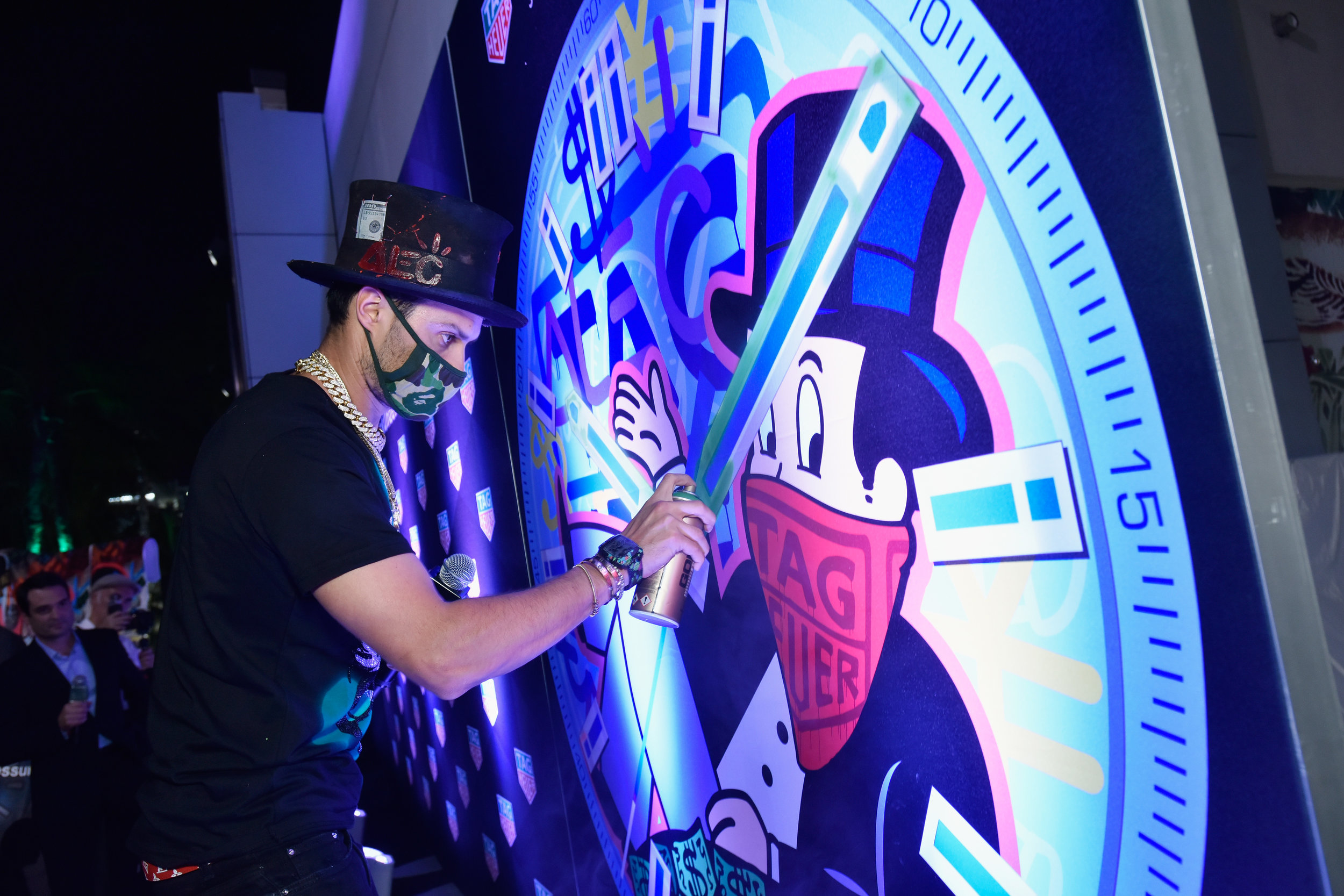
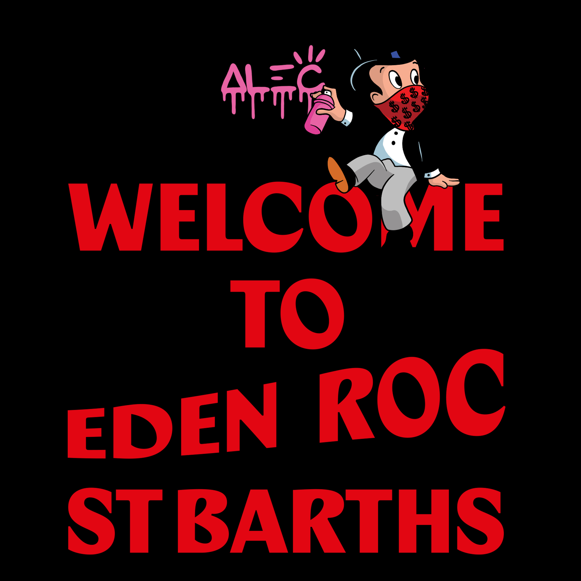
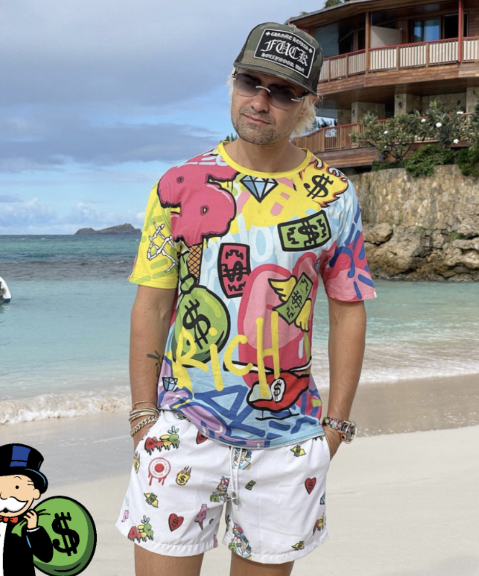
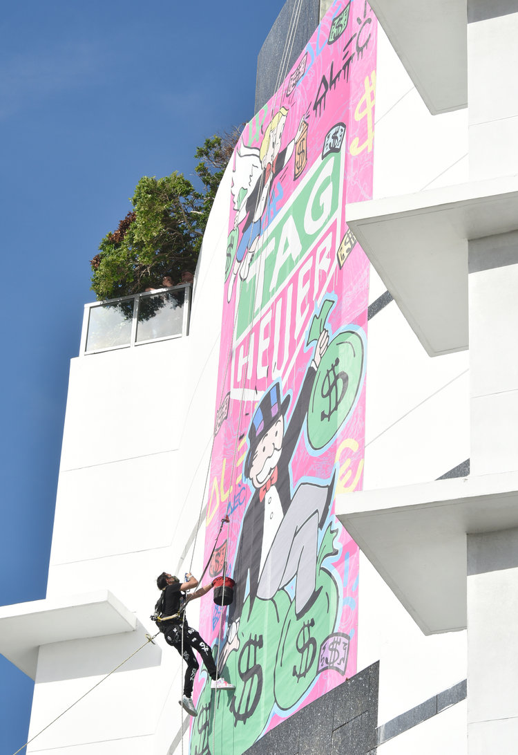
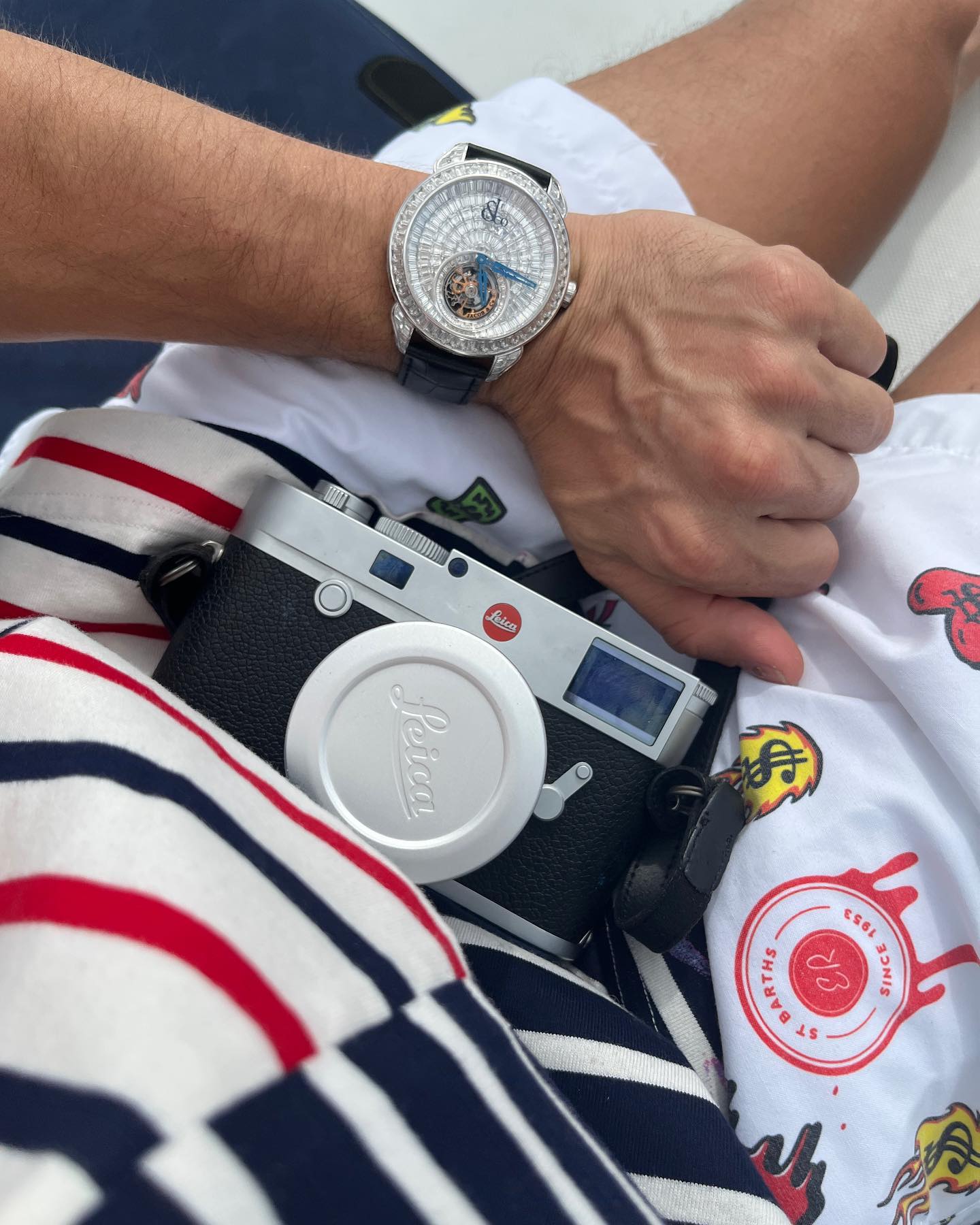
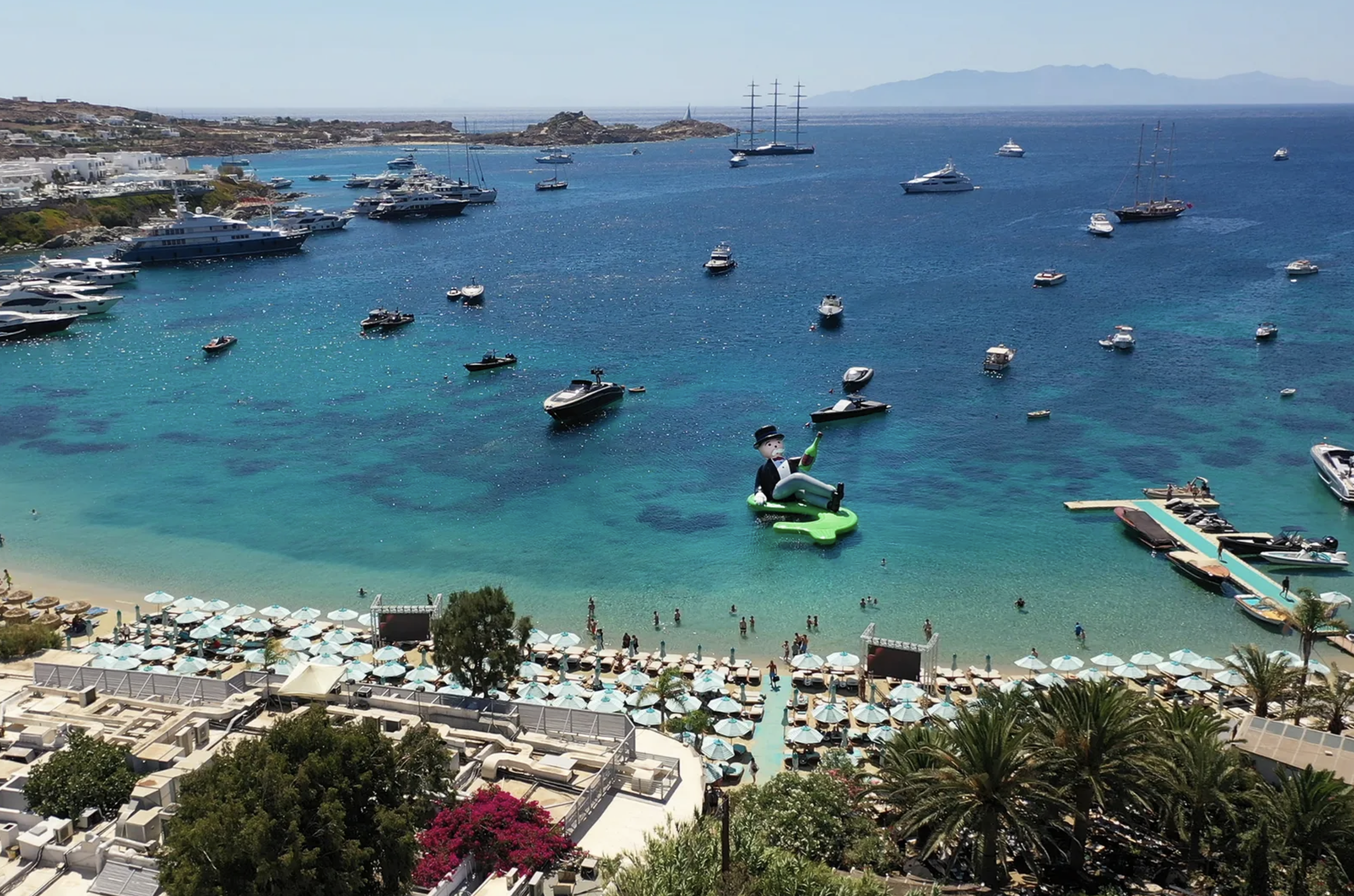
Alec Monopoly is a contemporary street artist who rose to fame for his unique style of combining elements of pop art with graffiti. We had the opportunity to work with Alec Monopoly to design a collection for St. Barths and Art Basel.
The collection was inspired by the vibrant and luxurious culture of St. Barths, as well as the exclusive art scene of Art Basel. We worked closely with Alec to incorporate his signature style into the collection, while also adding a tropical and illustrative twists to the pieces.
The result was a line of limited edition artworks and accessories that captured the essence of both St. Barths and Art Basel. The launch were attended by leading figures in the art world and covered by various media outlets. The collection was featured in a number of art and fashion publications.
Team & Credits:
︎︎︎ Creative direction: Disomt Studios
︎︎︎ Merchandise: Disomt Studios
︎︎︎ Production: Coolulu
︎︎︎ Client: Alec Monopoly, Miami Art Basel
Services:
︎︎︎ Creative direction
︎︎︎ Merchandise
︎︎︎ Brand Activation
︎︎︎ Concept Development
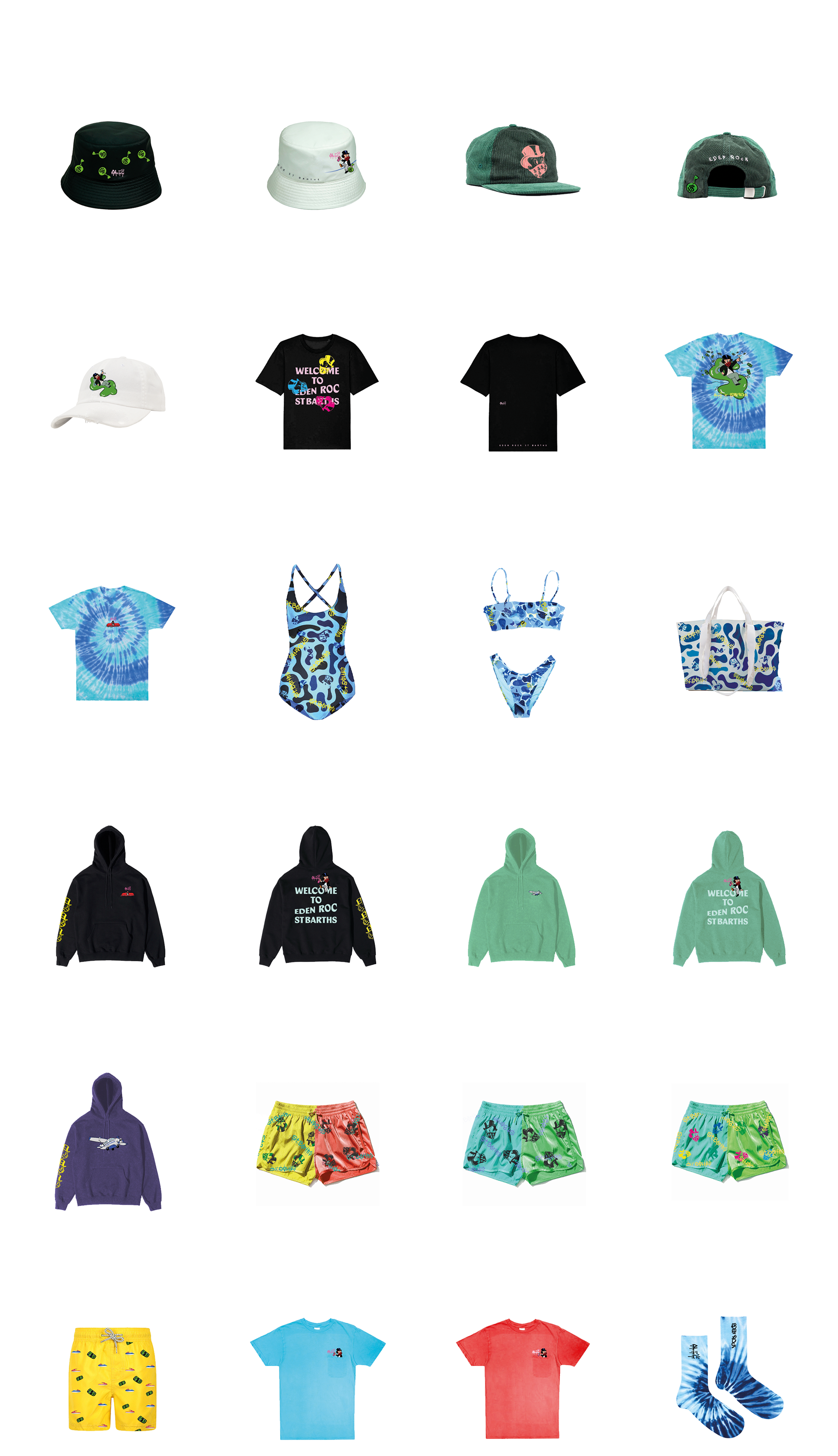
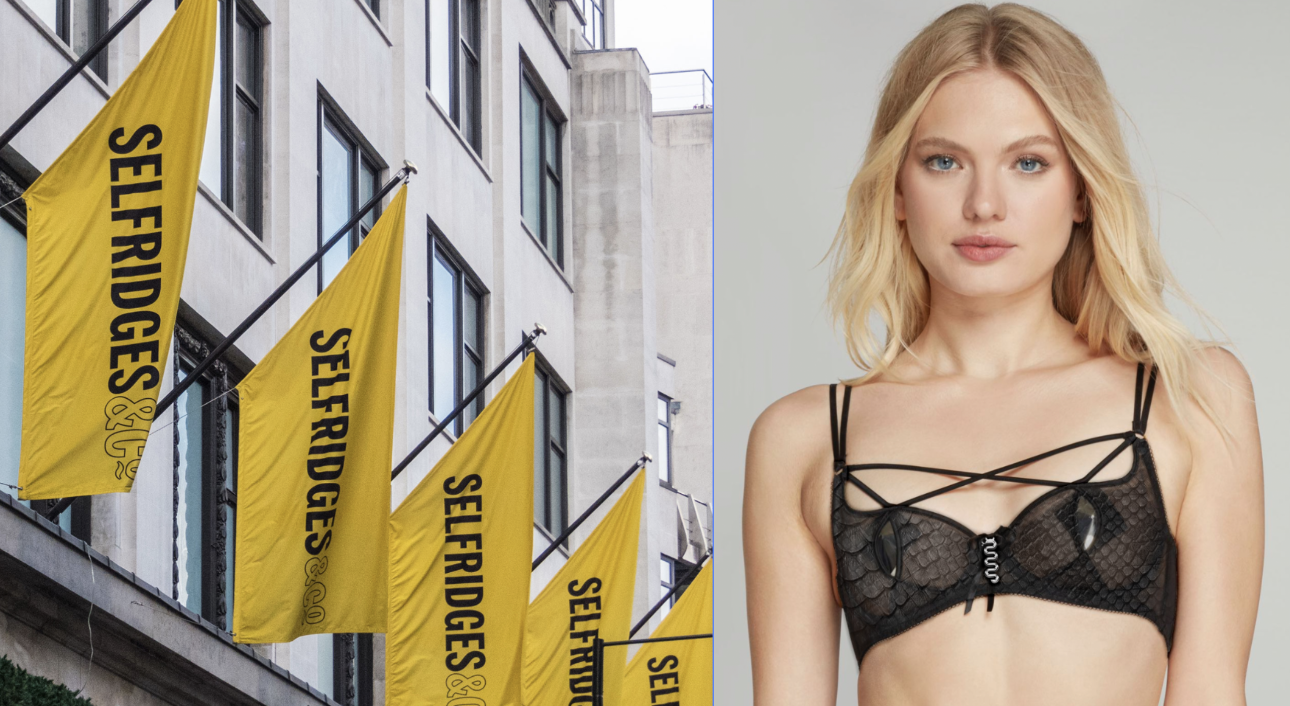
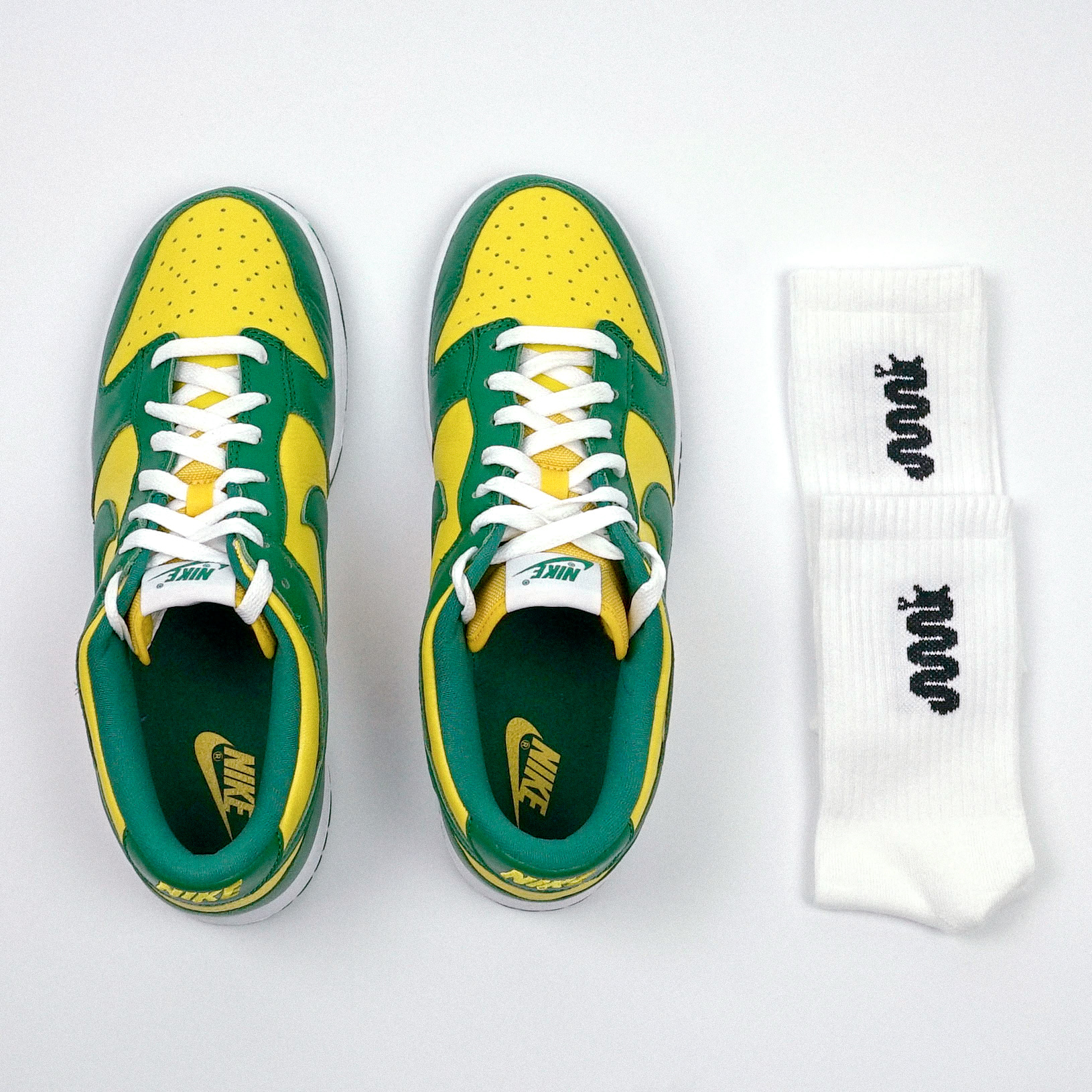
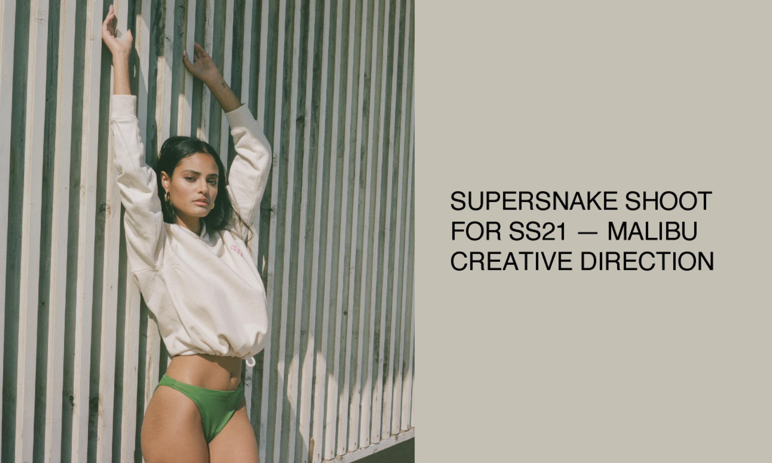
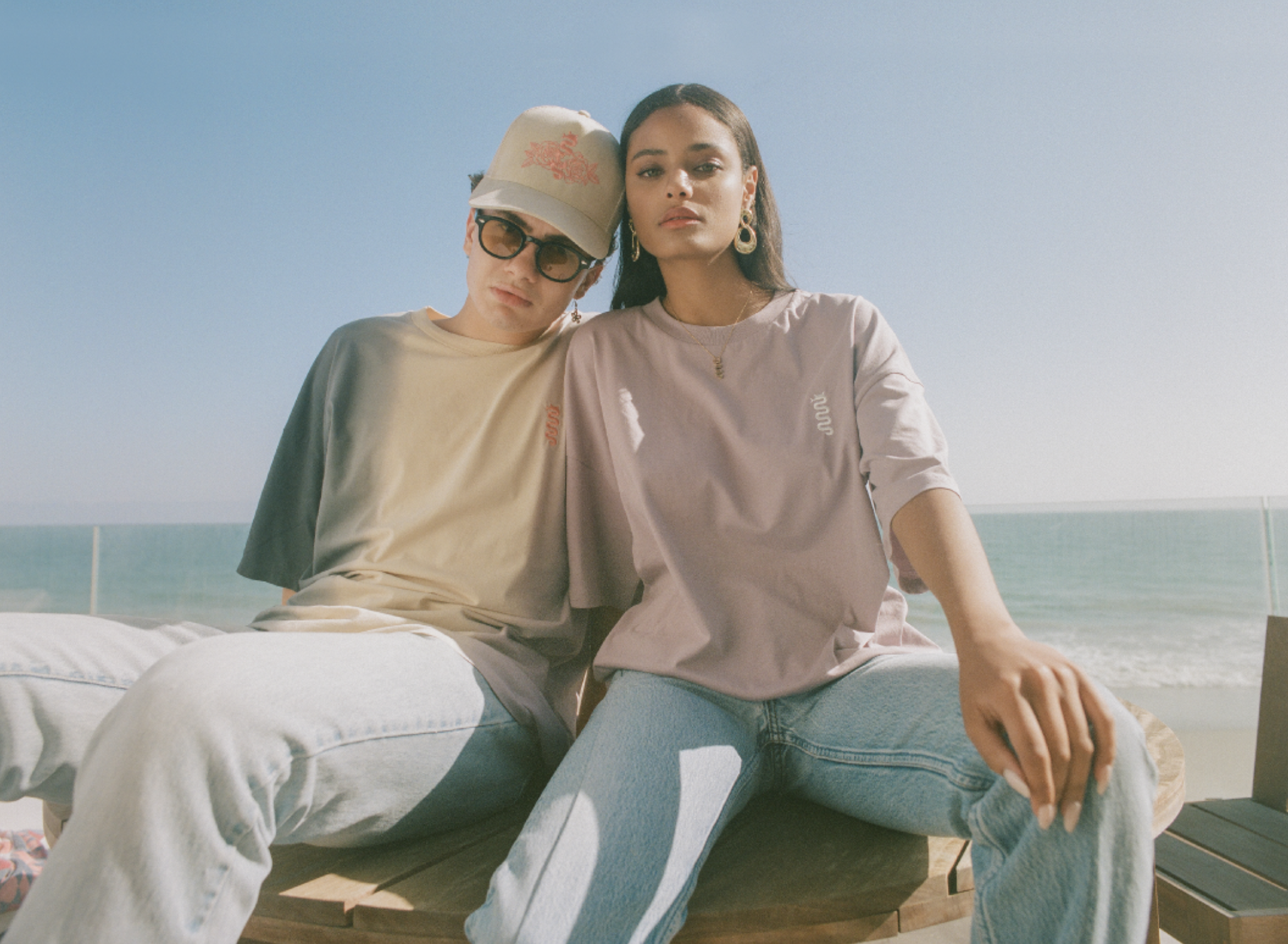
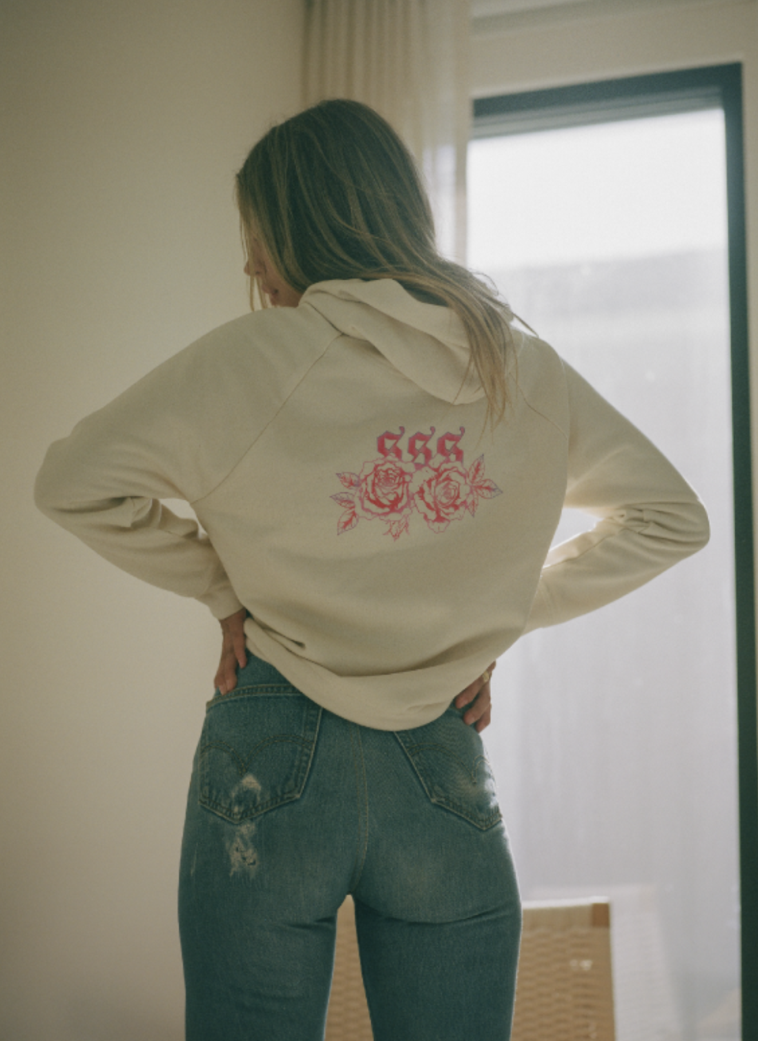
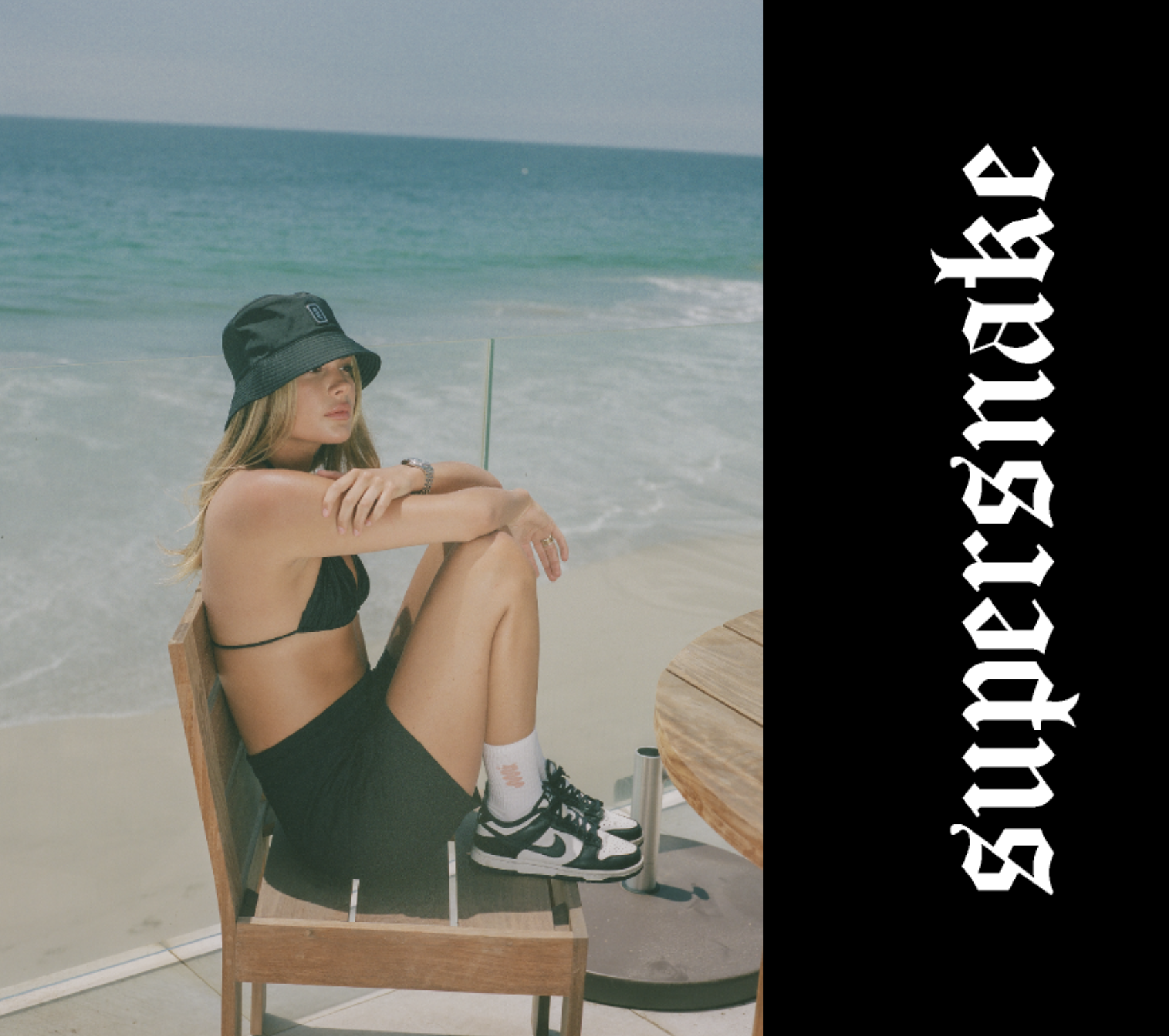
SELFRIDGES x SUPERSNAKE


PROJECT INFORMATION:
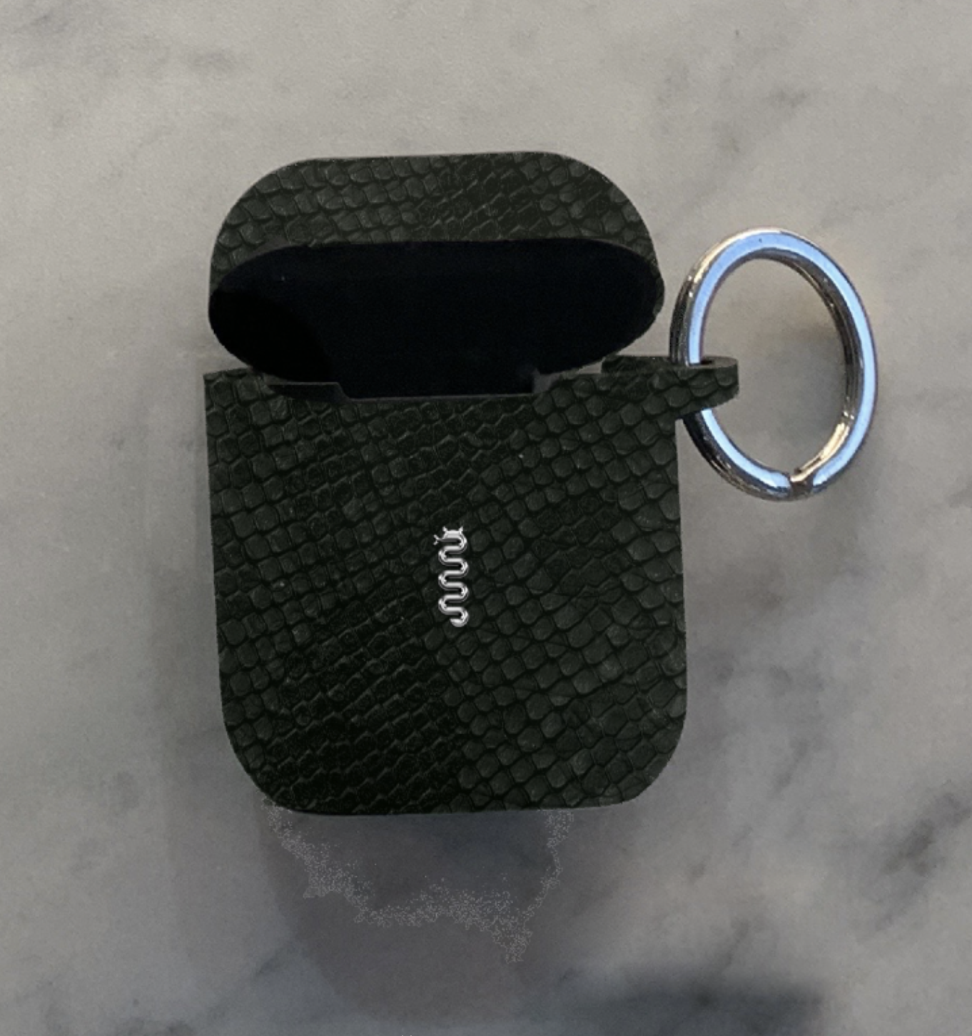
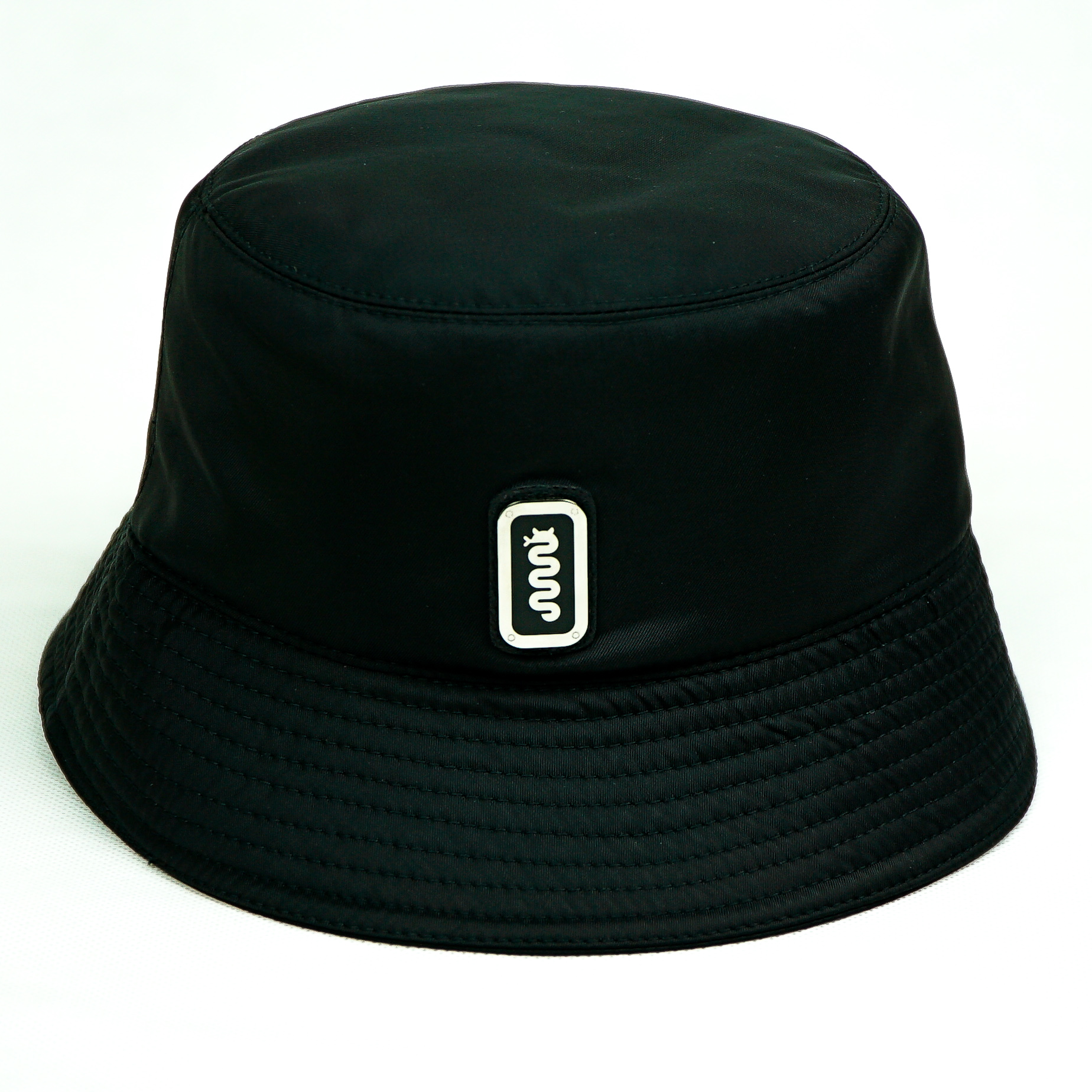
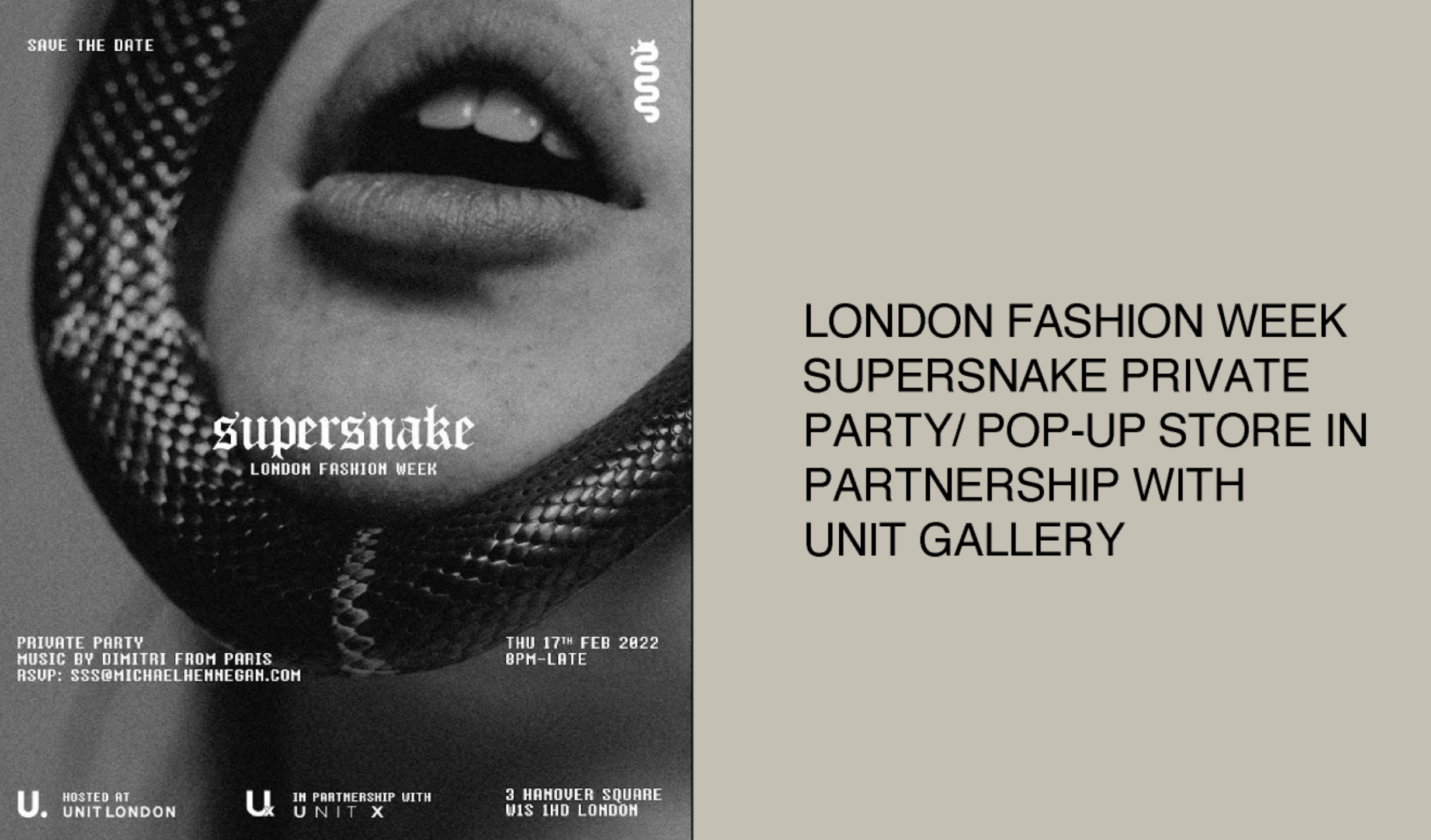
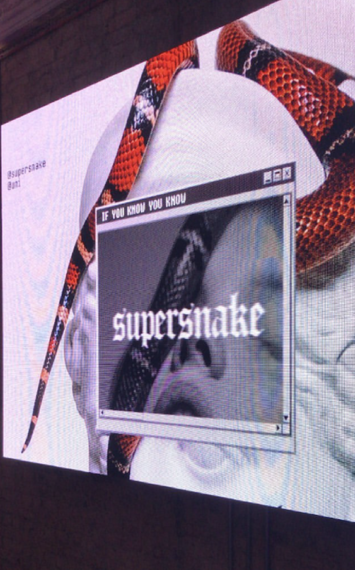
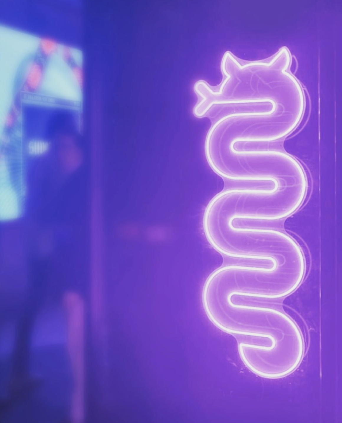
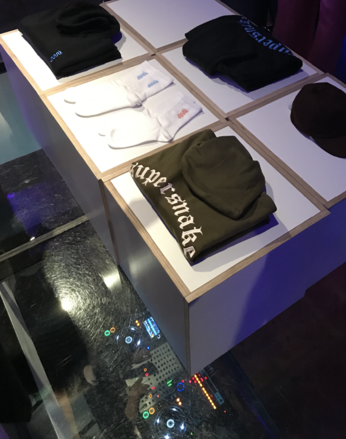
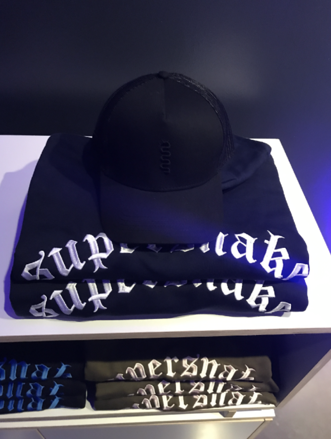
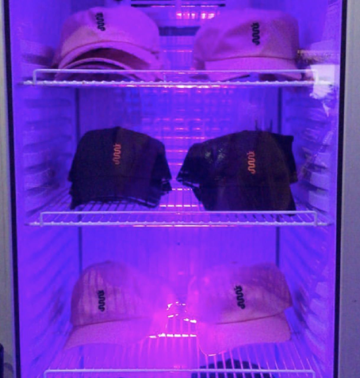
We were approached by the Instagram Phenomenon @supersnake and brought on this project for the launch of their clothing line showcased in Selfridges. We created a selection of clothing, as well as art directed the overall look and feel of Supernsnakes particular style and humour. In this way, our studio created a flexible visual identity that could move dynamically across apparel and campaign materials — rhythmically adapting to its environment.
We drew inspiration from a variety of sources, including international fashion trends and the Supernsakes unique aesthetic.
The collection was featured in several high-profile fashion publications. Many pieces from the collection sold out within the first few days of being available in Selfridges.
Team & Credits:
︎︎︎ Creative direction: Disomt Studios
︎︎︎ Production: Coolulu
︎︎︎ Design: Disomt Studios
︎︎︎ Client: Supersnake in collaboration with Selfridges.
Services:
︎︎︎ Creative direction
︎︎︎ Branding
︎︎︎ Merchandise
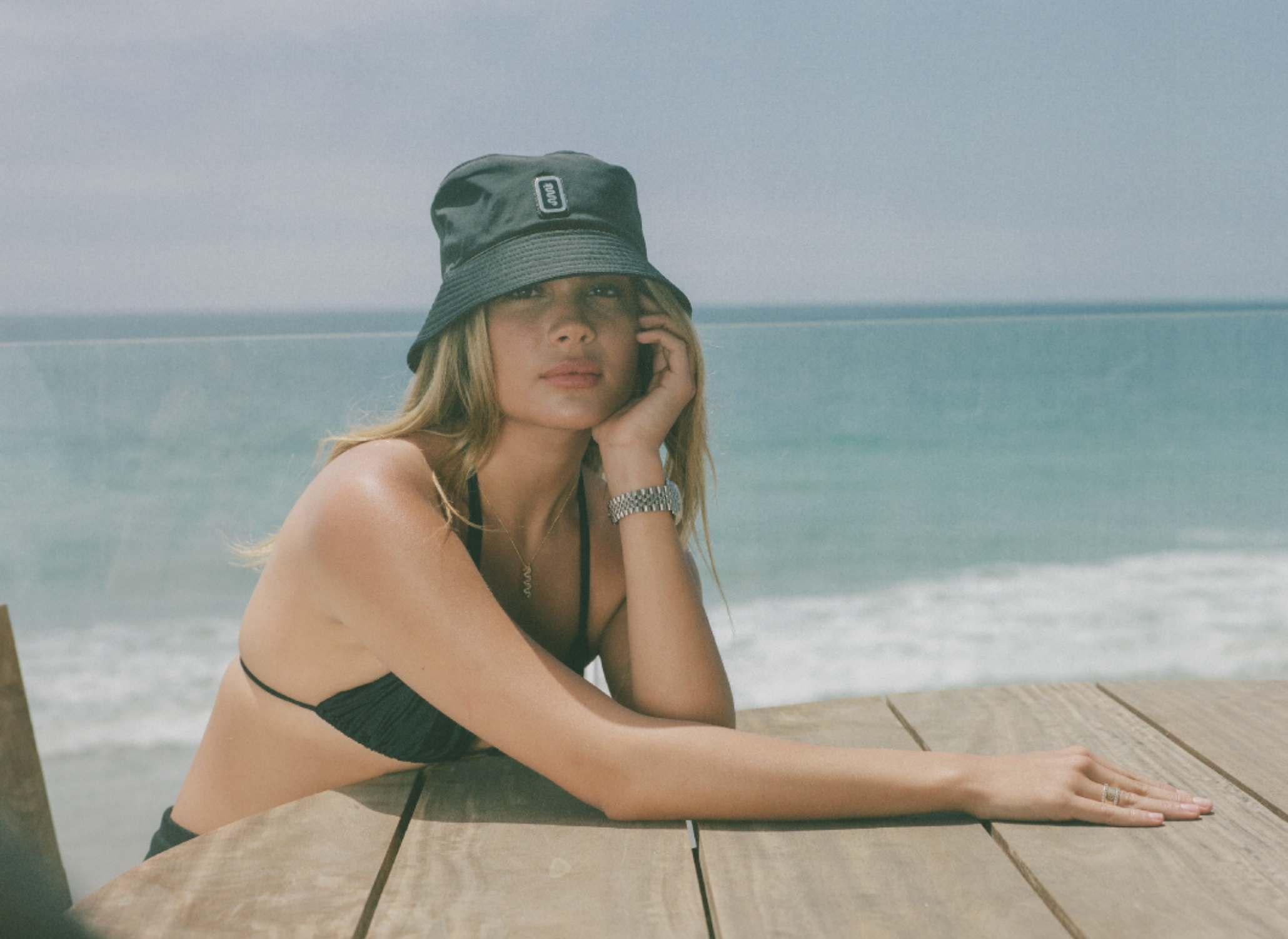
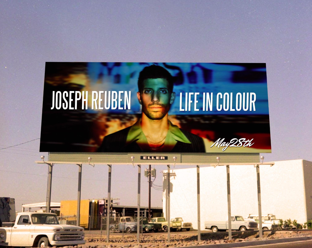
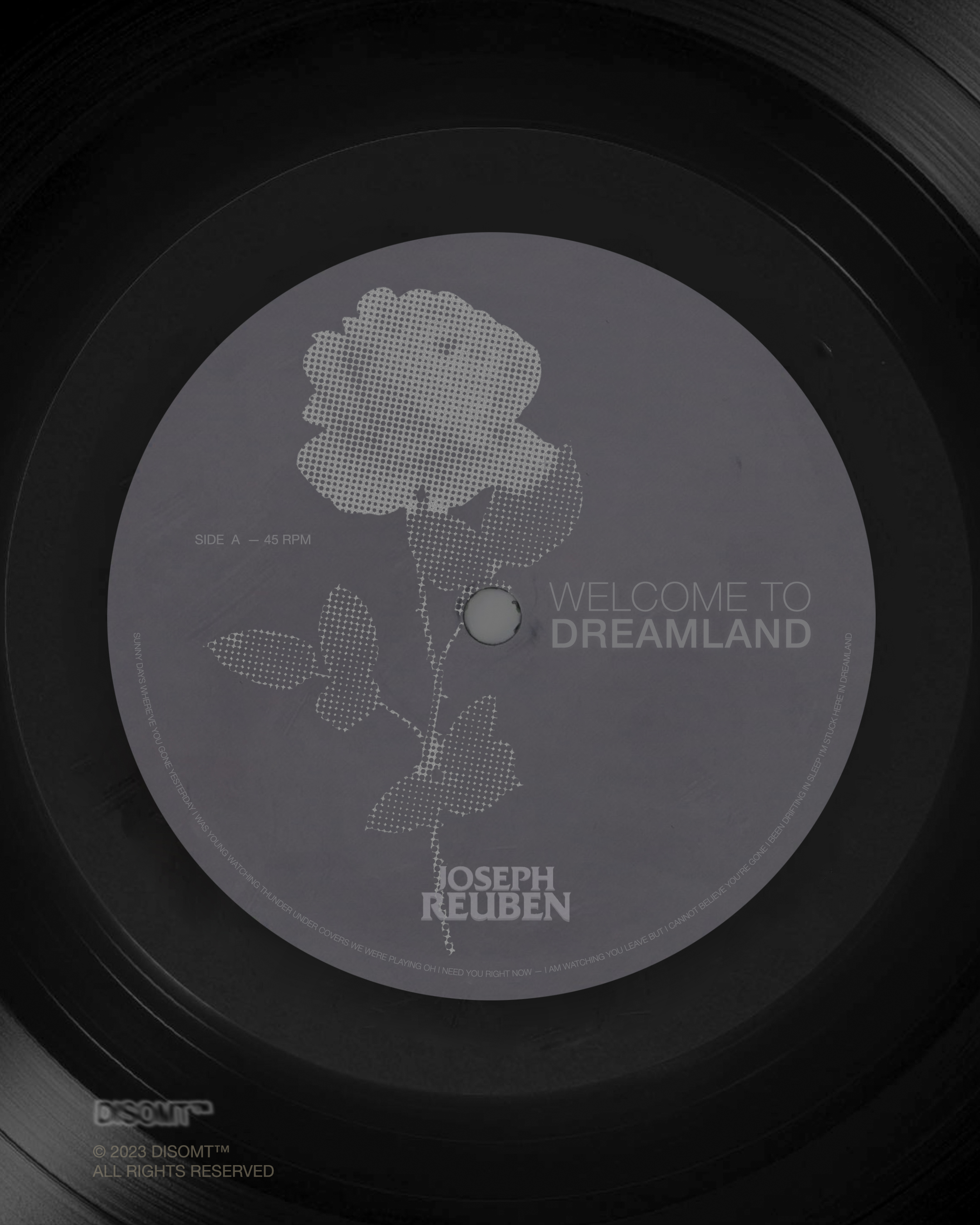
JOSEPH REUBEN


PROJECT INFORMATION:
Disomt Studios teamed up with Joseph and his producer Scarlett to launch his latest album “Life in Colour.” We oversaw parts of the creative direction inlcuding, Branding, Artworking, Production and Merchandise. We were also involved in the production stage of the merchandise from start to finish.
Our studio was brought on to design the look and feel of the campaign and album launch. The collaboration resulted in a wide range of both print and digital assets to be used throughout the album.
Team & Credits:
︎︎︎ Creative direction: Disomt Studios
︎︎︎ Producer: Scarlett Karmel
︎︎︎ Design: Disomt Studios
︎︎︎ Production: Coolulu
︎︎︎ Client: Joseph Reuben
︎︎︎ Special Thanks to Scarlett and Joseph
Services:
︎︎︎ Creative direction
︎︎︎ Branding
︎︎︎ Album Launch
︎︎︎ Merchandise